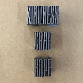
I was able to grab the morning in the studio and just wanted to do something small - pretty much anything - to feel like I had inky fingers and words were happening.
Back in January I mentioned that my touchstones for the year were to be kindness, care and hope.
They remain so, and thus I chose to work with those words as I fiddled and faddled with some type.
I love this typeface - Empire 72 pt. So elegant and reminiscent of Art Deco glamour.
How I prepare it,
This is Falstaff 48pt. It is much squatter, but I love the thicks; they gather so much luscious ink and look sumptuous when printed.
The right way around again.
Followed by the still-to-be-classified elegant gothic/blackletter typeface. Such a contrast; but so lovely - 36pt.
I love how it has two different lower case e s. (Always hard to write the plural of a letter).
I chose the drop down one when finishing a word and the neutral baseline one for the middle of a word.
Kindness
Care
and Hope
They printed up OK on this scrap of paper and I shall put them to good use!
Back in January I mentioned that my touchstones for the year were to be kindness, care and hope.
They remain so, and thus I chose to work with those words as I fiddled and faddled with some type.
I love this typeface - Empire 72 pt. So elegant and reminiscent of Art Deco glamour.
How I prepare it,
And how it should look - flipping the photo - this is how it should print.
This is Falstaff 48pt. It is much squatter, but I love the thicks; they gather so much luscious ink and look sumptuous when printed.
The right way around again.
Followed by the still-to-be-classified elegant gothic/blackletter typeface. Such a contrast; but so lovely - 36pt.
I love how it has two different lower case e s. (Always hard to write the plural of a letter).
I chose the drop down one when finishing a word and the neutral baseline one for the middle of a word.
Kindness
and Hope
They printed up OK on this scrap of paper and I shall put them to good use!


