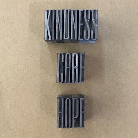
I was able to grab the morning in the studio and just wanted to do something small - pretty much anything - to feel like I had inky fingers and words were happening.
Back in January I mentioned that my touchstones for the year were to be kindness, care and hope.
They remain so, and thus I chose to work with those words as I fiddled and faddled with some type.
I love this typeface - Empire 72 pt. So elegant and reminiscent of Art Deco glamour.
How I prepare it,
This is Falstaff 48pt. It is much squatter, but I love the thicks; they gather so much luscious ink and look sumptuous when printed.
The right way around again.
Followed by the still-to-be-classified elegant gothic/blackletter typeface. Such a contrast; but so lovely - 36pt.
I love how it has two different lower case e s. (Always hard to write the plural of a letter).
I chose the drop down one when finishing a word and the neutral baseline one for the middle of a word.
Kindness
Care
and Hope
They printed up OK on this scrap of paper and I shall put them to good use!
Back in January I mentioned that my touchstones for the year were to be kindness, care and hope.
They remain so, and thus I chose to work with those words as I fiddled and faddled with some type.
I love this typeface - Empire 72 pt. So elegant and reminiscent of Art Deco glamour.
How I prepare it,
And how it should look - flipping the photo - this is how it should print.
This is Falstaff 48pt. It is much squatter, but I love the thicks; they gather so much luscious ink and look sumptuous when printed.
The right way around again.
Followed by the still-to-be-classified elegant gothic/blackletter typeface. Such a contrast; but so lovely - 36pt.
I love how it has two different lower case e s. (Always hard to write the plural of a letter).
I chose the drop down one when finishing a word and the neutral baseline one for the middle of a word.
Kindness
and Hope
They printed up OK on this scrap of paper and I shall put them to good use!


what the world needs now!
ReplyDeleteSo very very true Mo!
DeleteIf only the thoughts could be translated off the page. Very lovely fiddling and faddling!
ReplyDeleteYes, thoughts into action time I think. I do love a good fiddle-faddle Lesley!
Delete