Pages

Thursday, November 29, 2018

Thursday Thoughts...

“I have noticed that when all the lights are on, people tend to talk about what they are doing—their outer lives. Sitting round in candlelight or firelight, people start to talk about how they are feeling—their inner lives. They speak subjectively, they argue less, there are longer pauses. To sit alone without any electric light is curiously creative. I have my best ideas at dawn or at nightfall, but not if I switch on the lights—then I start thinking about projects, deadlines, demands, and the shadows and shapes of the house become objects, not suggestions, things that need to done, not a background to thought.”  

Jeanette Winterson, from “Why I adore the night” 

I simply love this reflection on the difference between darkness and light and the impact they each have upon us.

With the lights on, we tend to talk about externalities; within the darkness we turn inwards.

The words made me stop and think about do people argue less when it is dark, and I honestly think they do. Sitting around a fire it is quieter, the pauses are longer and I don't really recall heated discussions at all.  Interesting. Oftentimes, people just sit in silence and stare.

Even the way Ms Winterson suggests that turning on a light, is like flicking a switch to action - to focus, to activity, to deadlines, projects and doings...that we lose the suggestion and the background when things are fully illuminated, is so insightful.

I wonder how easy it would be to increase those moments of quiet darkness, shadow and reflection in one's days?

What a way with words she has, and what an observer of the oft unnoticed moments she is.


More things can be spoken of in the dimness...

Cromarty 2018.

Tuesday, November 27, 2018

Finished!!!

Ta da!

It is done.  The goal I set myself of printing samples of every typeface we have has been completed.  In reality, I have printed every typeface that we have that was catalogued...as we went along I discovered typefaces that were still inboxes and some that were in trays and several that were in complete and utter upheaval...so the job is done but there will be a few additions down the track once others are tidied and identified.

T was full of Times - mostly in smallish sizes too which are particularly fiddly.

This one is 10pt, and like Gill of the same size, there were no spacers.  In this case their wasn't even a zero - hence the big O in 10pt.  I also had to tuck upside down letters in to make the block square so it really is an odd bod of a thing.


Enough of Times (and there were several more) and onto the final typeface Univers.  A very simple sans serif we have 12pt and 18pt.  And 18pt was the end of printing.


I was running out of time over the weekend, and Barry offered up his services to come and help me out - he cut card, cleaned type, printed type and put type away which really sped things up for me and we managed to do the last 5 in record time. Altho in my rush I may have spelled Univers wrong?


The final day's printing results...


Here are some of the random proofs I was doing along the way on all sorts of papers. A lovely composition of its own.


New jobs emerged as we went along - like transferring some type from the boxes they were in to containers that separate them letter by letter to make it easier to select and diss the type.  

We discovered a few different arrangements for having the type in its own little compartments, so there are a few rainy day jobs ahead yet.


 And Sunday afternoon we watched a storm front go by...


Now the samples need to dry, we need to create the 5 sets, sort out just how they will be bound to enable the insertion of new typefaces the come along or are discovered, and then the scanning/copying of them onto cards to have spares as well. Yee ha - feels great!

Now to prepare for teaching this weekend.

Sunday, November 25, 2018

Almost there and beauty

The beat goes on...

The rhythms of collecting the type drawer, setting the composing stick, finding the spacers, selecting each letter of type individually, setting it into the stick, repeating with each letter until the fullest alphabet that can be made has been made, removing the block from the stick, sliding it over to the chase, lifting it and hoping it doesn't explode, positioning it, locking it up, testing it, locking it up again, carrying the chase to the press, inking the type, proofing on scrap paper, getting the 5 x cards ready, inking, printing, inking printing, inking, printing, inking, printing, inking printing, taking the chase back to the table, unlocking the chase, dissing each individual letter of type back into its correct place in the type drawer, carrying the type drawer back to the cabinet, collecting a new type drawer...continue.

I got to set and print the type on both days of the weekend, and the finish line is well and truly in sight now.

I think I made it through to T on Saturday...

This is 72pt Rockwell Shadow which is clearly missing the 'C'. It is so large I couldn't get more than the name on the card.


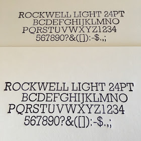
A quite tidy Rockwell Light


A bit of fun with Script Bold


Spectrum is pretty sensible and safe - but good for printing books and poetry I think.


And then Studio Bold offer something completely different again.
It is quite fascinating to see them all appear in ink - you get a really different feel for them when they are printed, compared to when they are in their individual compartments and are reading back to front.


And once again, it's Spring on the mountain. We planted a tree down the back on Saturday morning and on return to the house, the sun was catching the purple agapanthus out the back and I thought it was like a purple haze...


The roses are also blooming and we picked 4 buds at different points along the blooming line...
Saturday  morning.


 Sunday morning.

 The warm weather is really encouraging their opening.


A beautiful day dawns on Sunday


And the veggie garden gets watered.


A full weekend!

Thursday, November 22, 2018

Thursday Thoughts...

Stop measuring days by degree of productivity and start experiencing them by degree of presence. 

Alan Watts

At first glance this doesn't seem like a quote chosen for the theme of 'art' but it didn't take long for me to equate it to my current ongoing analysis and attempt to understand a creative life and all that that entails.

I am not sure where the need or drive to measure myself in a productive manner comes from - probably a pinch of work ethic; a tad of business and management experience; coupled with a smidge of a commitment to not wasting my days - makes for an interesting recipe.

And it seems that off this baseline I measure my creative life by how much I make.  And as folk who have been reading this blog for a bit know, I have been less of a maker in the past little while and more of a preparer, a layer of groundwork so to speak.  And for my sense of self that has been hard.

However I do love the second part of this quote where the word measure is gone and the notion of experiencing your days is introduced, and considered of far more importance.  And not just experiencing your days; but experiencing them by recognising how present you are within them.

If I switched my mindset from" I am not being creative when I am doing this stuff; I am not being an artist" to "I am supporting my creative life; my creative life has so many different elements within it and it is good that I get to do all of them" and followed that up by "I am doing this work to support my creative life; I know it will make things so much better in the long run. I will focus, be present and enjoy the success of knowing that each step I do is actually a really important help".

Which can all sound a bit twee when I write it out simplistically like that; but underpinning the idea of transitioning my thinking is the understanding that even this receptive task is valuable and important work.


A lot of the letterpress work is a slow slog to get organised before ever being able to ink and print...

Tuesday, November 20, 2018

Alphabets, type, books and orchids

Every spare moment is currently spent in the studio printing my way through all our typefaces and getting ready for the sampler book.  I am a bit bored I must admit, but perked myself up today and re-focussed.  It is good that even small breaks - an hour - can give me a chance to print or set or clean a couple of fonts.

And so it continues - I have made my way to P which is feeling pretty good.

 We have three sizes of graphic Script - it is a stylish italic, but I am never quite sure if I would use it!


I couldn't believe the name of this one - Grotesque No. 9 - and as you can see we have no lower case 'u' which makes it look even dodgier!


We raced along from G toM - and how I love Marion. Sigh.


Onto P and there are few of these. By the time I reached Parisian Ronde I was tired and a bit cranky with the repetitious nature of it all, and did not do my best prints; but told myself they are proofs for a sample book, not for proper use.  And then I snapped back into doing things properly!

I have just ordered ten more packs of the postcards I am printing on so I can go back and re-do the ones I feel I let myself down on a bit.


 And the last of the Ps is Placard Bold Condensed in 4 point sizes: 30, 42, 48 and 60.  We have a lot of letters in all of these and I think they are nice and strong yet still friendly.


Here in Australia it is certainly Spring and the garden is glorious at the moment. Each day I pick flowers of different sorts and hues and colours and the house is pretty full of colour and fragrance which is a fine way to be.

Outside the studio is Barry's book wall, and some of my Dad's crucifix orchids.

They are a riot of colour at the moment and just make me smile each time I walk over from the house.


Books and orchids - what's not to love?

Sunday, November 18, 2018

Working through the alphabet...

I am slowly making my way through the alphabet of the print sample booklet - I think I have made it through G!

Here's a few of the different typefaces I've worked with along the way.

An all time favourite Empire 72pt - we also have it in 36pt, caps only.


This Engravers old English we have in 42pt and 48pt and it is so strong. I know it will perfect for something.


I am missing the S and the a and the l and maybe the w...


Isn't this bold and beautiful?


And this, gorgeously deco-ishly elegant, caps only.


A few of our Garamonds...


Gill - so much Gill! from 10pt (with no spacers) to 48pt, here are a few of them.


Creativity doesn't all happen in the studio - it's happening in the sewing room and also in the kitchen.  Here's a hazelnut meringue cake I made for a birthday gathering today - it tasted good too! Despite looking decadently rich it wasn't too sweet at all.


Thursday, November 15, 2018

Thursday Thoughts...

“TV. If kids are entertained by two letters, imagine the fun they’ll have with twenty six. Open your child’s imagination. Open a book”

Unknown

Sometime the thoughts I ponderer are not deep or ponderous; sometimes they are just thoughts that catch my eye and make me smile.

This is one of those ones.  Part of me likes the simplicity and the play on words/letters here; but what caught my imagination most was the visual of all those letters bounding out of bag or out of book and being played with!

It feels like you could open the pages of a book and all the letters and words would tumble out and chase each other around trying to grab the child's attention; exciting them and wanting them to get involved in the fun that reading can be.

I like the notion of reading exciting children. Of reading being fun. And of books opening imaginations up wide...


Lots of letters and words...

Tuesday, November 13, 2018

An article and more 'creative life' time

I was approached a while back by journalist to see if I would be OK if she were to include me in article she was writing fro the Australian Decorative and Fine Arts Societies journal called 'art life'.  I was more than happy to be included and sent off the images and promptly forgot about it.

On our return from Scotland I discovered a copy of the journal had arrived and the article was contained within.

It is a lovely consideration of books as art, and of different approaches by different women, in the making of their artists' books.

I am very pleased to have been included and enjoyed reading the various stories.


My part is titled "from print to politics" (what a surprise!) and features two of my favourites "A Subversive Stitch" and "Time to Change".


And after sharing the article it is back to what makes a creative life. This is the state of my studio desk this morning after unpacking from the weekend workshop and having to shift and move a heap of things in preparation for a possible re-arrangement of the studio space.

I had planned to just keep printing and preparing a for a workshopI am teaching, but clearly there is a new priority and I am calling this part of the creative life "Supporting a Creative Life".  Tidying, sorting, cleaning, setting up; all of these things form part of the underpinnings to a creative life.  They need to be done in order to do the most important part, the making.

In the past, I have kind of disregarded this element of the creative life and been annoyed and frustrated by it; but I am slowly coming to realise its importance, and am making peace with the time it takes to do.  Soon things shall be clear and calm again and I shall be inky once again.


And as promised a quick look at my finished book - a quarter case binding I think it is called...