Pages

Tuesday, March 30, 2010

Milestone giveaway

Well, I've just snuck in to my 100th post - which amazes me somewhat - and I'd like to celebrate by giving away one of my handmade journals.

I chose this one because it kind of has a rainbow thing going as well - in so much as it has nice colours scattered here and there throughout. It uses Somerset watercolour paper and is hand-stitched with purple waxed linen thread.

The perfect gift for artists and writers, it can also be used to hold favourite recipes; book group book comments; dreams; dinner party reminders - who came what you ate and drank; gardening notes - what you planted and when; or as a guest or visitors book.

To be part of the giveaway, describe what you like about rain or rainbows in exactly six words in the comment box below this post. If you can't do comments - send me an email and I'll make sure you're in the mix.

'Entries' close Tuesday 6 April and I'll post the winner on Wednesday 7 April.

One of my rainbow thoughts goes like this: Rainbows make me smile. Happy heart.

Thanks for playing and reading!


Monday, March 29, 2010

Rainbows in the valley

We've had quite the time of it of late with lots of rain; but happily after the worst of it (when it was wall to wall rain and living in the clouds for days) we get to share rain with sunshine.

Today as we were working away; we looked out across the valley and saw a rainbow IN the valley - we were looking down on it!  It seemed quite wondrous to me.  There was also the hint of a double rainbow.

One thing that still fascinates me is that if you see a double rainbow, the presentation of the colours is reversed or mirrored. That is, the outer edge colour of one is the inner edge colour of the other. You can kind of see it here...


Sunday, March 28, 2010

A Letter a Week (ALaW) 12

We are nearly halfway through the first alphabet for A Letter a Week 2010; my how time flies! When we visited our friend Pam in Canberra, she showed us some pieces she had done with this technique and I thought for sure I should try it.

I first painted Arches Velin paper with black acrylic paint.  After drying, I painted over that with some gold acrylic which had some 'retardant" added to slow down the drying time so you could 'work' it.

I then used the sided of a bonefolder to make some sweeping gestures and lines, allowing some of the underneath black to show through, and then used the point of the bonefolder to outline the "L". It was fun and I think there will be other ways of using it too. Maybe next time I'll try for a stronger contrast with the black.

Thursday, March 25, 2010

Maleny Library 'Exhibition'

The Maleny Library supports local artists by providing display/exhibition space for free.  There are two glass cabinets in the foyer and a good sized wall inside.  Artists simply book whichever space they prefer for 2-3 weeks, leave their contact details, and folk can buy direct from the artist without any commission.

I currently have  a series of journals on display in the foyer cabinets.  They are surrounded by some 'pebble scrabble' rocks I wrote on years ago; and some cut out letters from a piece where the negative space of the letters was used over another gorgeous background.  The pebbles and letters were simply decorative and not for sale.

Her are a few shots of the display - some have even sold!


Monday, March 22, 2010

Barry's 100th post - its' a giveaway!

My husband Barry and I started blogging about the same time, but he has reached a milestone just ahead of me - he did his 100th post last week.  Mine is coming up soon so stay tuned for another giveaway; but in the meantime, why don't you head on over to his blog and leave a comment about quietness or stillness and you never know you might win his beautiful bowl! Gotta love a bit of cross-promotion!

Sunday, March 21, 2010

Abstract calligraphic art - Denise Lach

I mentioned how this book inspired me to write my letter 'J' recently and promised to write some more. There is so much to look at and think about with this book that it will have to happen in small chunks.

I have chosen here three of the page spreads from Denise Lach's book that astounded me and made me buy it without even really looking at it in too much detail.  I love taking photographs of texture; often close-up and showing the detail of something that might otherwise be missed.

I had never in my mind made the link between my texture photos and their potential to inspire abstract calligraphic art. Now of course, I wonder how one earth I missed it and can see so many fabulous opportunities opening up.

I am totally inspired by this mark making and the inspiration for it. What do you think?


Saturday, March 20, 2010

Paper play and painting

It's been a funny old week in the studio - bits and pieces of this and that all on the go at once.  I've been doing my letter, preparing some pages, sketching designs for some sculptures, preparing a workshop on bookmaking, preparing some fabric and pondering a piece to make for an art auction.  I've also discovered I kind of love having all these things going - always something to do; not stuck waiting for one stage to dry before being able to do something else. All good fun!

I have been very happily just sitting and painting pages for books.  Doing all the backgrounds in preparation for...something! Here are a few from the week's play.

Thursday, March 18, 2010

A Letter a Week (ALaW) 11

Another week, another experiment. When visiting our friend Noela a few weeks ago, she gave me some of the gold foil that is used for hot tooling letters and designs onto leather books etc.  She quickly showed me how to use a hot iron to transfer it onto a surface - especially PVA glue that has dried. It looked great on her mixed media work - dashes of gold; hints and traces here and there.

So I thought - I'd better try this out for one of my letters. The 'K' was drawn onto some card with a pencil, filled in with PVA glue, left to dry overnight and then the gold was transferred using a hot iron.

Not a brilliant result, but I think in the spirit of experimentation and learning that it's quite OK to retain the less than perfect ones - because they act as reminders of the trickiness of the technique or the potential for the technique.  I think because I was after a solid application it didn't work as well - the traces and hints seem to be better, and I'm not convinced that going over and over with the iron doesn't actually melt the glue somewhat!  All in all, good fun and I now know how I can use it on other things.

The bottom shot is the gold foil, front and back

Sunday, March 14, 2010

Abstract calligraphic art - glyphs

Back when we were building our house we had a rubbish 'skip' in place to gather all the remnant building materials. I fell in love with the rusted marks on its side, and then began a series of handmade books called Urban Glyphs. These books used fragments of photographs of the marks made in urban settings - metal, concrete, plaster all showed me marks.

I termed them glyphs because they could be interpreted as some form of language or writing that we couldn't understand - but they spoke to me of language nonetheless.

Here is the first and my favourite. The book now resides in a friend's collection.


Saturday, March 13, 2010

A Letter a Week (ALaW) 10

This week's letter has been a bit more like calligraphic doodling and playing rather than attempting to explore unfamiliar mediums. I got this simple idea from a book I bought recently "Calligraphy A Book of Contemporary Inspiration by Denise Lach (of Switzerland).

I will post more about the book and her work another time...but for now I used what I have always called a music pen - but not everybody does.  It is a pen with five mini - nibs which produces five parallel lines (hence my thoughts re music). I chose to write the letter "O" with this nib over and over again - about 6 rows of 5 "O"s; then turned my square 90 degrees and did the same again - so the "O"s overlapped and produced the background pattern for my "J". I love patterns.

I am thinking I will mount my experimental alphabet so it looks something like a sampler and expect that this little red number might provide a little focal point.


Friday, March 12, 2010

Abstract calligraphic art - Rosalie

I think I'm about to go on a bit of a wander and try to pull together some thoughts and images on what I think about as abstract calligraphic art - art that uses words, letters, text as a base or a key element; yet is not proper calligraphy.  This has been gnawing at me for a while so I figure I need to explore it.

I came across some images of Rosalie Gascoigne's work in the newspaper today and they reminded me how much I respond to her works. The ones that use text, provided the initial way into her work for me. I am seriously enamoured of most of her work now; but the letters and the texts drew me in first.

Using broken up script from road signs or crates, these pieces nearly always hint, tempting the viewer to try to read the words and make some sort of literary sense of the work, providing clues only, not an answer. Rosalie loved language, poetry and writing and her works reflect this. She also had a wonderful eye for balance and patterns, producing harmonious pieces.

A number of pieces from different exhibitions can be found here.

Text, 1992

Sweet Lovers, 1990

Sunday, March 7, 2010

A Letter a Week (ALaW) 9

The alphabet continues and I'm just getting this one done in time for the  week.  I wanted to try and do a mono-print as part of my exploration and decided that "I" was the perfect letter to try it with.  At least I could pretty much write an "I" and have it print reversed without being too tricky - the thought of writing an "S" backwards so that it would print the right way and still look good was too daunting so I thought I should grab the moment with the"I".

I fiddled a bit with rolling out ink and trying to get the right consistency to draw into it and still have enough ink to print a back ground with. Tried lots of tools and ended up using a blunt carpenter's pencil - it took a fair bit of ink off. I then placed some Canson paper on top of it and rubbed it gently with a bamboo baren as I didn't want to push too much background ink back into the scraped off letter bits. I love all this learning!

Saturday, March 6, 2010

Golden abstract alphabet

As promised, this is how I first used this alphabet.  This is a long scroll with Japanese cards that slot into tabs on the front of the scroll. I made 12 cards and there are 7 tabs, so you can choose the words you have on display, and move them around. I do love interactive art!

I made it for an artists' book exhibition and it now happily resides at my cousin's house.

I think in the end, it is pretty legible - there is enough commonality with an ordinary alphabet that your brain does the tiny little jiggle it needs to do to interpret a letter here or there and make sense of what you see.

Thursday, March 4, 2010

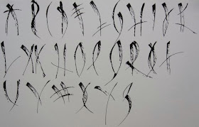
Abstract alphabet

A few years ago I wanted to design an alphabet you couldn't read - yet could.  I worked on one where each letter was formed with the same number of strokes that would form the Roman capital version - they were just placed differently and curved in most instances.

This is what I came up with.  It possibly has few more refinements to go; but I like it.  I'll show you how I've used it another day...

Monday, March 1, 2010

Alphabet Letters A-Ligned

It's funny how things you do years ago finally find their way to being useful!  Back in 2004, for no reason I can adequately explain, I sat down and did a little analysis of the alphabet.  The Roman capital was the alphabet of choice given its historical script credentials.

I discovered the following pieces of information (which have finally become useful as Barry does fold-forming for his A Letter a Week pieces) and just in case you've ever wondered...

  • 22 alphabet letters have straight lines
  • 15 have ONLY straight lines
  • 16 have vertical lines
  • 8 have horizontal lines
  • 10 have diagonal lines
  • 3 have diagonal lines ONLY
  • 6 have diagonal and straight lines (vertical or horizontal)
  • 1 has diagonal and straight lines and curved lines
  • 11 have curved lines
  • 4 have curved lines ONLY
  • 7 have vertical and curved lines
To illustrate... a remnant from the Roman forum.