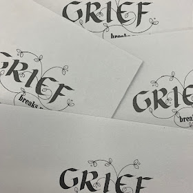
It is interesting to me how people respond to the grief cards I make. When I explain why I do it, how I use them myself, and what each of them says, people really seem to get it.
One person came in the other day and bought the last of my "grief breaks us and re-makes us" cards. They told me why, and who it is was for, and how after a year or more, it felt as if it said the right thing for where their person was at.
And so I went about making another version.
First up I did the letterpress printing on the bottom right of a soft Grey Magnani Pescia paper DL card. And after all that practise and attempting to select an appropriate looking hand for the words, I added some calligraphy.
Even with my love of the spare and of sparseness they did look a bit grim!
And so I pondered how to gently elevate them. I thought about an entwined vine and was thinking of doing it in black pen. And even to me that seemed a little bit too grim again. Barry suggested trying maybe white or silver to see if that lightened things up a touch.
So I did, and we both agreed it didn't work. So my trial card got added to with black and bits of colour. We thought gold and metallics maybe to add highlights?
But I wasn't too fussed with that. So it was back to the coloured pencils to test and to check.
And then the pattern, drawn in black ink.
But because each piece of calligraphy is slightly diffenret - it might start 5mm to the right; it may be bit higher; the gaps might be slightly smaller... I chose to transfer the design through the tracing paper with an embossing tool. This allowed me to see through to the letters and move the design around as needed.
The embossing tool also just pressed into the paper and provided a guide for drawing on with the pen afterwards; no pencil as transferred, so less cleaning up.
So there they are all drawn in and fitting with their slightly varied calligraphic bits.
And then some details highlighted and coloured in.
And doesn't the grey change depending on the light?!?!
Here they are packaged and ready to go.
And then as I started to print another set of cards which have been 'bestsellers' - I laughed. Mind your ps and qs is a tenant of letterpress and here is the perfect example of why!
I feel it could be read as a birthday blooper...


Ha! I just read a quote about minding your p's and q's in 'I'm Your Man:: - the life of Leonard Cohen' by Sylvie Simmons and was wondering where it stemmed from, thank you!
ReplyDeleteWell there you go - some useful information shared! sorry for my late reply...
DeleteHad to laugh at your blooper but do like your grief cards
ReplyDeleteThanks Penny - a blooper indeed - I laughed as well! Thanks for your kind words about the grief cards.
Deletehow nice to see some calligraphy by your hand again !
ReplyDeleteThanks Annick - you are so kind. A few words here and there; I feel rusty but I do love trying.
Delete