Pages

Sunday, November 29, 2015

Open Studio and Pas de Deux closing

Next weekend will be a big weekend - Barry and I are opening our studio 601mvr on Friday night and Saturday; and on Sunday Pas de Deux, Susan Bowers and my beautiful exhibition at Noosa Regional Gallery, will close.

They both feel momentous in a  way.

On Friday night (4 December) from 5pm - 7pm the studio will be open, and we will have wine and nibbles to share and celebrate. To celebrate art, to celebrate the closing of the year, and to share and celebrate life with friends.

We will be open again on Saturday (5 December) from 10am - 4pm.


We hope it will be a fun time - and also give folk an opportunity or two to buy some gifts for themselves or others.

Barry has been busy making jewellery (20% off!), bowls and ladles and I have been helping him with packaging - making lots of small page pouches for his earrings to be packed in when they are sold.


I have also been doing the labels for the ladles...


I have been making some small journals of my own, some watercolour-cover ones as well as these small timber covered ones; that are actually more like group cards.   You know when you go to buy people a really nice big card so that everyone attending can sign - or as as a reminder of everybody who was at an event?  This one has "congratulations" all along the bottom.


I will also have some smaller versions of my nurture books on sale - called "Nesting" they are smaller, and less detailed but still with the main elements of nests, feathers and calligraphy.


The closing of Pas de Deux on Sunday is also a moment of note. It has been a wonderful, wonderful opportunity. I have learned so much and we have both had remarkable feedback. Many people have been two or three times; taking people to see it, wanting to share it.  It has felt very much like a coming of age or graduation for me - to see my work hanging in such beautiful space, being enjoyed and admired. Very moving.


As it says here, you have until 6 December 2015 to see it! Thanks to all who have attended, told others about it, told me how it makes them feel and written their thoughts in the book. What a precious precious memory.

Thursday, November 26, 2015

Thursday Thoughts...

“The artist is nothing without the gift, but the gift is nothing without the work.” 
Emile Zola

I'm pondering art this week and this quote is a nice one which reminds us that our art is really a combination of things.

I like that there is a gift involved - whatever that may be, the talent each individual has been gifted is unique. Artists need these talents and gifts to create; but just the gift often isn't enough. The gift needs us to work; to practice, to learn; to perfect.  The gift needs the skill developed over time and under different circumstances.

he gift is of no value if it isn't used. If time isn't spent with it, using it and developing it.

I think there may be a very few folk , very very few, for whom the gift doesn't need work - for whom it just appears and delivers.

I think the working, the refining, and the challenging are all necessary and valuable, and I think that possibly if we do these things over time, then the gift can deliver work for us quite effortlessly. But we know we have done the work that makes that seem possible.
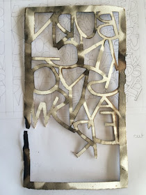

Evidence of the work that lies behind the finished, etched product...and of course, before that there are the years of calligraphy practice and learning...

Tuesday, November 24, 2015

Beyond bombs and burning...

I posted my three books for the Al-Mutanabbi St project off to the UK today.

Here is what I said about them:

This book reminds us that even when books are burned, the ideas and thoughts within them survive. They are absorbed into people’s minds; they are shared between friends; and they become even more powerful. In this book, burned pages are held within light timber covers, which can be read as a sacred object or as a book. 

The quotes used are: 
Every burned book enlightens the world (Ralph Waldo Emerson) 
The paper burns but the words fly away (Akiba Ben Joseph) 
Books cannot be killed by fire (Franklin D Roosevelt)

I had thought I would do a concertina book; but couldn't find an elegant or meaningful solution. Then I thought I might wrap the pages and bind them somehow, but I couldn't find a good way to do that either. I started to see in my mind's eye the bifold doors of an icon - the back panel with two side panels, and thought that might work with my three pages.

And so it was.


Standing, the first glimpses.


Fully open, standing.


Fully open, lying flat like a book.


We bought the beautiful small hinges in Prague last year - with the notion of using them on books well and truly in my mind. This then led to the trick about how to attach them to covered grey board covers, and so I turned to wood. But not wood that might cause customs problems in differing countries where they travel; rather balsa wood which is light, clean and crosses borders well. It is also  bit delicate, and will bear the marks of being handled.

The pages in more detail.


The three books together.


I have made an edition of 5 and I will keep one book for myself and the other will be available for sale at some point. I wish them safe travels.

Sunday, November 22, 2015

cutting, inking, burning...

As mentioned previously I am working on three books for the Al-Mutannabi St Starts here project.

I have now managed to cut out the pages for the three books (my finger gave up cutting out all five pages I had prepared - here's hoping I don't stuff any up).

The remnants of cutting out nine pages.


Here are the nine lined up, and overlapped and looking lovely - I am quite fond of the white, the negative space and the layering of multiples.


And here is the page after I painted walnut ink onto the the pages. Quite gorgeous in its own right!


After drying, slight smoking and then more smoking...


Edging closer...

Thursday, November 19, 2015

Thursday Thoughts...

“When I open them, most of the books have the smell of an earlier time leaking out between the pages - a special odor of the knowledge and emotions that for ages have been calmly resting between the covers. Breathing it in, I glance through a few pages before returning each book to its shelf.” 

Haruki Murakami

This quote about old books in old bookshops perhaps, is just so right.  I have been trying to work out what it is about old books that I love so much. Is it their tatty covers? their thick pages? their smell? their stories?

All I know is that I feel like adopting each and every old book I come across; I feel like rescuing them and I'm not sure quite why. I thought I might want to make something with them, but I don't always want to.  Sure, I sometimes use old Reader's Digest pages to make pouches for my pebbles or for Barry's earrings; but I rarely pick up a beautiful old book and want to make something with it.

Somehow it is more personal than that. There is definitely something wonderful about holding them in your hands, feeling their age and history; the weight of them, the wonders they offer you inside, and yes...the smell of ages.


I took this photo in the studio of a wonderful Japanes printmaker in Tatebayashi on our last cultural exchange - it shows a beautiful old book I so wanted to hold.

The main reason I chose it today is because I was hunting for pink - along with Jennifer and Julie. The soft, worn, faded to pink, cover of this book just captured all the emotions of this quote for me.

To see other pinks from around the world - have a look a Jennifer and Julie's blogs.

Tuesday, November 17, 2015

Stories in the sand...

We have just returned from a few days away by the beach. A time to stop, to sit, to wander, to walk, to read, to swim, to dream.

Each morning and evening we walked along the expanse of beach and I loved coming across the stories in the sand that wee animals left behind them as they went about their business.

Aren't they beautiful and amazing?

The sand crab balls looked like whole countries on a globe to me -


The perfection of each one...


Rolling out to the sea...


And I don't know who was doing this - but I stopped often to smile at the this and that meanderings, every which way, curling here and wandering off there...


Every day was different, mornings, nights, tides in, tides out, sunshine, overcast.

'Tis good to stop and just be.

Sunday, November 15, 2015

More burning, more books

Most of my major artistic commitments are over for the year, with a few exceptions.  I have to deliver three books to the Al-Mutannabi StStarts here project in the UK by December.

These books have literally been on the back burner for most of the year as I pulled together the work for the exhibition.  But they have been percolating away in my sub-conscious on occasions. I managed a few scribbled ideas, a few notes jotted here, sketches there.

I have finally had time to to test the ideas; not yet to make the books; but to test ideas and start the work.

At first I thought I would work large and tried some writing templates.


I cut one out to see how it looked - all pristine and white it was.  I figured it needed to look more burnt, damaged or as if it had been through a bit at least. So I waved it over a flame to see if I could get the smoke marks I was  after. And I did like them.


On the opposite side I had inked it up with walnut ink to see what that looked like - would the brown link more to burning? I liked it. I smoked that side a bit too; then started to think about scorching and burning the edges of the paper.


Which of course can end in tears if one is not focussing properly! I wasn't actually looking for a full burn-through effect, so have decided not to go with the flame burning and will test something else out instead.


Overall,I didn't really like the large size and how large the letters had to be to try and fill the space, so I went down a few notches in size.

I tested them out with skeleton letters, then the thicker letters.


 And decide I liked it. My mind then turned to which side to cut out from?  I could transfer the letters to the front of the page and cut them out from the front; but then I was left with the need to rub out all the pencil marks - a bit risky with fragile joins and connections on the pages.


If I cut from behind (with the template reversed) then I was left with these extra sort of folded up bits on the edges of letters.


But I could smooth them out with teflon bone folder - I also discovered if I changed the blade more frequently then the the folds didn't appear much at all.


And so I prepared fifteen pages. I cut one template for each of the three quotes, then traced it on to 5 pages.

Here they are before cutting.  Quite a time-consuming process to even get this far. Next - cutting, inking and scorching!


Thursday, November 12, 2015

Thursday Thoughts...

“There are two kinds of light—the glow that illuminates, and the glare that obscures.” 

James Thurber

This quote resonates with my former life of work-work.  I remember realising how much impact an individual could have on a workplace. One person.

There were 40 of us in our Branch and we got a new boss. It was amazing to see how much that one new person could change the vibe of the place, how we felt about ourselves and what we were doing. And it wasn't good.

When I became a boss at that level, I thought to myself, you can either be a person who shines a light on your workplace; or you can be the person who casts a really long shadow and I wanted to be the one who cast a light.

I think this light comparison here is similar - and goes to another of my workplace thoughts.  I often said (and still do) "every strength, when overplayed, becomes a weakness". And so it is with the light here - if you get it just right, you illuminate, if you overplay it, you end up blinding people. Not helpful

In the end, I think this ramble is trying to get to the point that really, it's always about balance and its always about context.  It might be handy to create glare in certain situations, but generally speaking, we should try to get the balance right in life.


Tuesday, November 10, 2015

Play day with Caren

We were thrilled when Caren Florance agreed to open our show - she is such a thoughtful and insightful thinker and writer around artists books and printmaking.  She is also an uber-talented letterpress person and of course I was in the throes of delight when we worked out she would be staying with us for a few days.

That meant I could get her into the studio and muck around a bit. Of course, what was totally the best thing about it was that I didn't only muck around - I learned heaps.

We had a morning to play and did quite well really.

I showed her this dirty old tray of type I couldn't recognise.  It was clearly a blackletter typeface, but I had searched my type books to no avail.

Not pretty this tray - it is next on my list for washing and cleaning during my spare moments.


We decided a really good project would be to try and print the type and see what was there - was there a full alphabet? What did all the letters look like? Could we discover what it was once we printed it?

But we started way back with the basics - the composing stick and measuring your lines.


I am pretty sure this is my hand given the hyper-extended thumb! I set the lower case letters.


Getting ready to pop the type into the chase and lock up. Also known as "make ready" this part is the part where it can take forever to get the type secure, pressure right etc etc. We faced a few dilemmas but solved all the problems and as you know, learning to solve problems together with an expert is invaluable.


Inking up - Caren even taught me a way of rolling the ink on a plate then applying it to the platen; you get much faster coverage this way - another excellent tip.


We did many many trials and re-set the tampen paper and actually completely unwound all the pressure off the platen, created a test chase to make sure we had even pressure across the whole chase as we wound it back in and when we got it right, I loved the result - here are all the 'characters' I have in this typeface - I love the extra ower case r where it has a drop; and the additional lower case h where it has a drop below the line as well. But really, the whole thing is just so elegant. Look at that lower case y!


Once we'd printed a couple of samplers, I then of course went to town!


I think I was most enthralled with pieces where I printed this rigid, formal, upright typeface over abstract calligraphic pieces - I loved the tension and the variations so much.


 \
No scrap of paper was safe from the whirling printing dervish I became. Whilst I was madly grabbing this paper and that, Caren was very kindly dissing some type into a type drawer for me - the perfect guest in so many ways!


And to finish before cleaning up, Caren let me video her tying up a type form. Very good. So this is what you do with type that you want to keep to use again, but in between you need to print other things in your chase.


A fabulous few hours in the studio with an expert, I think we should do it again sometime!