Sunday, June 4, 2017

A little bit all over the place...

Wow. A week ago we were in Melbourne, tomorrow we fly to Jakarta.

At the same time as we deal with travel and sadness; we are both having to push through so many art projects and commissions - try to make small gains, even tho we are about to lose another week of working on them.

Before we flew to Melbourne last weekend, there was a gorgeous harmony and unity project in our main street - looking up to the sky at all the threads that connect us...


I had a few moments to consider whether one or two red lines would work best on this print...


In Melbourne we were able to visit the organisation where I had done words on windows and the stitched stories...

I really love how when the blinds are drawn; the shadow words appear as well.


I saw the boxed works on a wall for the first time, bathed in sunlight.


 I came home and progressed a book job that is waiting - a "This is your life" type Life Membership book for Apex.


And managed to collect some trial frames I am preparing for Sydney.

I don't know about other folk; but when I make work I really prefer to make the work, then work out how big it ends up being as I choose frames and mats to support it and make it look its best.

With the show in Sydney, we have very limited space and I have to make work that will fit in that space.

So I asked our local framers to prepare a couple of frames of different widths and colours, and a double mat that would allow me to look at how much white space I wanted around the piece; how deep the mat board and how wide the frame itself.

Here is how a couple of them looked today. There is another double mat to collect as well and test the amount of white around the work and the depth of the mat.

So many things to plan for and prepare for!

2cm white frame

 
3cm white frame

 
3 cm black frame


I am pleased I asked him to do this as they all make the work look quite different!

Thursday, June 1, 2017

Thursday Thoughts...

“It’s impossible” said pride. “It’s risky” said experience. “It’s pointless” said reason. “Give it a try” whispered the heart. 
 Unknown

Thinking thoughts about life today is poignant after the sudden death of a dear friend.

This little quote can almost appear trite in its whimsy; but after grieving the death of those too young to die; it seems to also speak eloquently.

Today it says to not wait, to try things, to have a go, to follow your dream or other sentiments along that line. For we never know the hour or the day.

Let us live with heart and lead a heart-filled life.

Give it a try...


As we raise a glass to you tonight...


Tuesday, May 30, 2017

Still considering calligraphy

So I started to think that to be complementary to the letterpress works, (as pondered in my last post) the calligraphy probably needed to be smaller. So I got out my 3A Automatic Pen and some good ink and used them to do the same style of writing in the square, just a fair bit smaller.


But this time, I left room for the inclusion of an etched plate just in case I really wanted them to look even more alike.

More of the fabulous stencil material, cut to size.


A draft of the lettering - once again done on BFK Rives printmaking paper. The layout leaves a bit to be desired - it all gets a bit squishy towards the end. But a draft is a draft.


The ragged right thing didn't happen quite so much - think I was more conscious of trying to finish the line with strong strokes; but also the smaller writing makes it hold together better.


 And because I started to think there might be something in this calligraphy idea - altho the style is probably not quite right yet - I did  a  test run on a scrap of the Gmund 300gsm cotton paper I am printing on.

It is a much whiter white; but I was happy to see it took the calligraphy ink well.


My final test for now, was checking to see how the Gmund 300gsm folded.  I had assumed because it is quite heavy that it wouldn't fold well and I wouldn't be able to use it for the companion books I am planning to produce.

I was very pleasantly surprised when I cut a scrap and folded it and it made a beautiful crisp fold! The book planning has also begun; because once I start printing for the wall works; I need to also print for the books so that the inks etc are all the same, and I am really discovering how much planning goes into a printed production! 

That means I need to know now, how big my pages will be; what sort of binding I will use; which leads to how I will place the prints on the pages in terms of layout etc, so once again my brain is beginning to boggle.


So its nice to take some time out and check out life onto block a bit- we have had loads of pumpkins and there are still more to gather.


We have had some really foggy mornings and mornings where the could puddles sit in the valley...

After which we are having beautiful bright days - and the magpies are loving it!


Sunday, May 28, 2017

Considering calligraphy...

Well my head is really moving at the moment and after trialling the first of the letterpress and sorting what seems like a gazillion things; I started to wonder if I could do some complementary calligraphic works.

I started on BFK Rives paper and set out a 10cm x 10cm square. A friend had given me a sheet of this remarkable stencil sheeting - which is low-residue sticky and re-useable.

Not sure if anybody else has trouble sometimes masking off areas on printmaking paper - and having the fibres lift with the tape - but this stuff is amazing (so far - only one or two tests, but both worked really well).

My square


And the stencil stuff.


I dipped some balsa in watered down ink and made square lettering marks - I was aiming for something rigid, slightly illegible and squared off. Lots of lovely wet ink in these pics.


Whilst it dried I decided to make some more peace postcards as well, using a mix of writing styles.


The next day it was nice and dry and the paper had uncockled itself after getting wet with ink.


Quite a nice square resulted and the stencils lifted up like they had never even been there - brilliant! Altho that ragged right edge is a worry again...


The details are nice too.  Not sure if this is going to be a go-er or not - more pondering to do.

Thursday, May 25, 2017

Thursday Thoughts...

“The secret to success is learning to go from failure to failure without loss of enthusiasm.” 
 Winston S. Churchill

At first glance you might not think Winston Churchill was talking about art...but I think his words apply as much to art as to anything else in life.

Perhaps they just spoke that little bit louder to me of late as I am making my way forward, inching my way forward and making mistakes and having to start again, or at least revise the way forward!

I like that he focuses on the 'no loss of enthusiasm'. Enthusiasms is kind of code for passion, or belief, or desire to make the thing you want/need to make I guess. Maintaining your own enthusiasm for the process and for the work is really what gets you through. For me of late, it has been my inherent belief that there is good work be made, tantalisingly close if I can just keep with it and keep pushing through.


Mistakes...I've made a few...

At least when I look back at this I realise my typesetting skills are improving!


Tuesday, May 23, 2017

Progress happens slowly

I made progress on the weekend wth the prints for the Sydney Contemporary. By Saturday evening I had etched a new plate, inked it and printed it, and also done a proof of the letterpress over the top.

The revised plate before printing.


A small detail of the letterpress work.  After getting it all together, I printed, and found this rogue "u"! It was hiding in the tray of type, in the "u" section and it snuck in. So it was removed and replaced with the correct looking letter.

Don't worry about the messy double print - I proofed on the proofing press, then later on popped the type block into the Lightning Jobber and decided to just over print without ink to see how well try first attempt at registration worked - kind of sort, but not quite!


At first I had the test block left-aligned, leaving a ragged right edge.  Given the imagery is so graphic, a square within a square, the loose right edge worried me.


So it was back to the drawing board and I rearranged the type and the letters so that the text block was more fully justified. Interesting process, but it felt so much better.


The re-arragned type.


I did four proofs and got the registration pretty good on all of them - this was the worst; the type bled over the edge of the etching a bit. It still looked OK as a whole tho.


 By Saturday night I could look at the work as an image, and my heart sank.  After all that planning and work I thought I'd have to start all over again - it felt too obvious, and too flat.  There was no life in it, no interest.  Not much fun at all.

So it was back to the studio on Sunday desperately trying to work out how to rescue it - whilst doing things like fiddle with paper and write on garden stakes. I was hoping that sometimes things work out better if you distract yourself.

I needed another element, and Barry and I talked about embossing - where, what sort of imagery. how much, the same imagery for all four pieces or different for each one?  I had also been thinking about  a splash of red somehow - but again, where, how, why?

I could come up with three marks the would work for three images - they made sense, maintained the integrity of the pieces; and added to the story. But I was stumped by the fourth.

The one that stumped me was the one about gender equality. The etched imagery pretty much says it all so what could I add as a mark that made sense?


I was thinking about the female symbol - the circle with the down stroke and the cross (Venus). Let me tell you that looked way too obvious and jarring.

I wondered about a simple dot/circle and tried to see how I could make one well (and reproduce it). I think the top two are gouache within a template; the bottom ones are a rubber/eraser on the end of a pencil dipped in gouache.


But in the end it looked too ugly and distracting.


The idea I was pondering was gender neutrality - that by removing the Mars and Venus elements of the symbol, we find ourselves thinking about equality and not difference.  My sense was that the gender symbols are mostly outlines of circles (not filled in circles) and so I began to see if I could do that somehow.  I traced around the template with a brush - very wobbly - and then Barry suggested some plastic tubing.  I went to the drawer to find some and came across the perfect dipping tool - an ink cartridge for a parallel pen and dipped away. I was onto something.


And then I placed it on proof print and thought - Yes! That is the mark I want!


And so we have a way forward...

Sunday, May 21, 2017

A real mixed bag

The weekend was full of variety - and time to do all sort of things that needed doing.

I made some progress on my etching and letterpress work, I met with a fellow about a new book commission and got the details so I can start thinking about that and I managed to do some small arty type chores/projects.

A life of and with art is never simply about making - the talking about commissions, wrapping and packing, pricing, and preparing are all part and parcel of it.

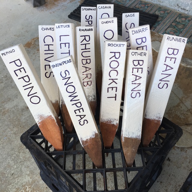
Barry is involved with the Maleny Neighbourhood Centre and volunteered to paint some stakes for the vegetable garden (it is a massive community garden that offers so many people in need access to fresh fruit and vegetables).  He also volunteered that I could write the names on them!


So after the stakes were dry from painting I sat down to work out what was needed. I decided that there was NOT going to be any calligraphy - I was simply going to sit down and write the names on the 50 stakes.

Which is easier said than done of course.

The style of pen was up for debate and given the size/length of the stakes and the length of the words, I chose the simplest bullet-tip marker, with a narrower tip for the top writing.


Because the words differed in length, I wanted to try and keep the size of the lettering similar, it couldn't be exact but I wanted it to look rather regular or uniform.  So I devised an excellent template!

 You can see the gap where I would write. It was attached to the table and flipped back; I put a stake underneath, lined up the top and bottom and wrote in the gap.


 One tub full.


A second tub full

Four tubs full full!

In preparation for September at the Sydney Contemporary, I am continuing the quest to work out how to present unframed work.  I spent a few hours going though books and making some small mock-ups of possible options.

I want to have the unframed works on paper presented in 'something', to make them look special.  I shall attach them to foam core and wrap them in a cellophane bag, but then I want a little bit more...


Fun was had! But no decisions made.

And then I packed up some commissions ready to deliver to their new home!