We end this year in the toughest of times; and look to the next one for some relief, and some good moments for so many who are suffering these fires that keep our country burning.
Each year I use the time between Christmas and New year to ponder, reflect, celebrate achievements and plan. Part of that is looking back over the year and the work I have made and pulling together the ones that I love the most; or the ones that made me smile or meant something to me.
It may simply be that by the end of the year it feels like it was a pretty patchy year (I probably say that every year) and that I am not sure that I achieved much at all; but then I start to wander through the works and realise there were some good things in there, so here we go, in no particular order as ever - just alphabetical.
My year in review:
1. Botanical Dyeing
Teaching and attending workshops brings you into contact with people with marvellous ideas and resources to share, and the story of a book that a student brought to class which then inspired me to have a go at botanical dyeing both here and in Scotland was a revelation - and I do so love the threads and their pegs!

2. Coasters
Planning ahead for a lengthy stay in the Scottish Highlands meant I was able to prepare some fabric and take some thread and sit and stitch some coasters for the cottage. I love that these are now part of our life over there...

3. Grief Cards
I have been so happy that folk 'get' the idea of my grief cards and purchase them and share them with others. It has been a real joy to make these simply illustrated cards, with tender words and thoughts for when words are hard to find.

4. I would have loved a sunburnt country
This was special. It grew from feeling helpless about our government's refugee policy of detention; and sorrow that so many find their incarceration unbearable and take their own life. But also, that our health and security systems fail them and they die unnecessarily. The State Library of Queensland purchased it and understood that artists need to bear witness to atrocities, and as a society, we need to keep and protect what they say as part of the public record.

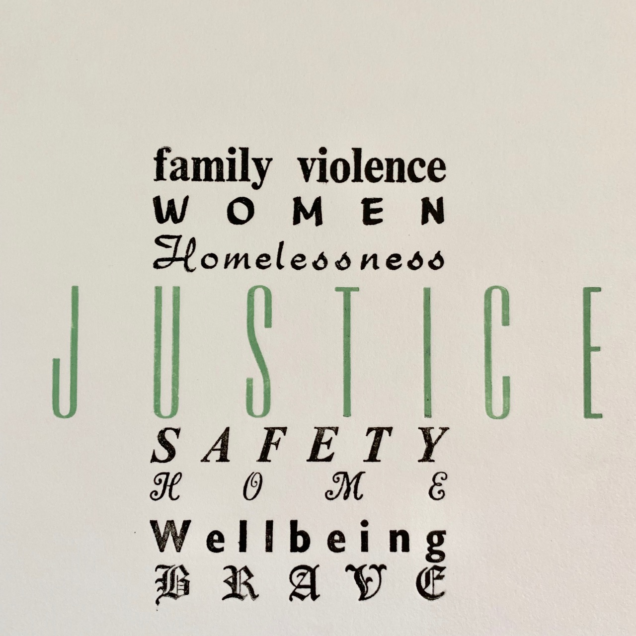
5. Justice
I was delighted to be asked to repeat this commission in a variable way. The organisation does such grand work, and these words capture the experience of women who are victims of domestic abuse and how the service helps them, empowers them and encourages them.

6. Light and Love
Once more, in response to tragedy, I made these wee books. After the Mosque attack in New Zealand that killed so many, Jacinda Ardern showed great leadership, compassions and courage and I used words from Martin Luther King to remind us how light overcomes darkness and that Love overcomes hate. I sent one of the books to Jacinda to say thank you.

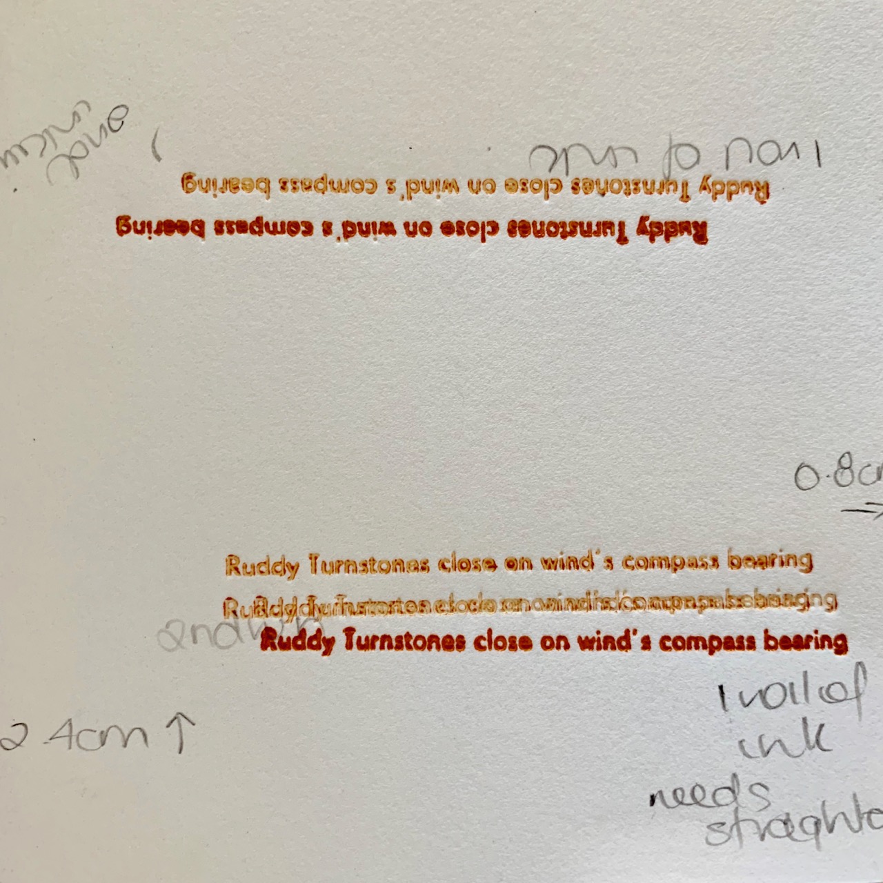
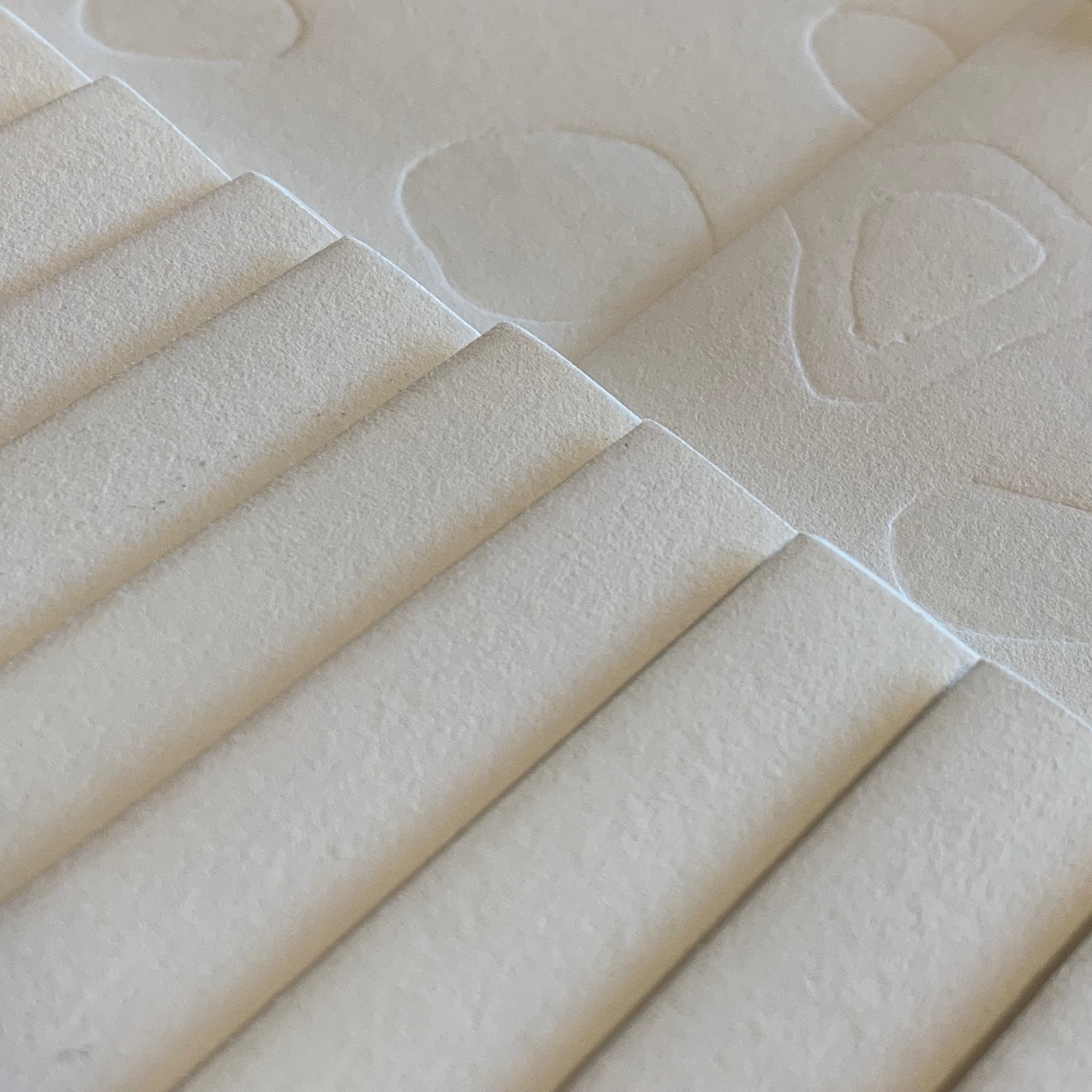
7. Ode to Stones
In last year's review I hoped that I might be able to include these in this year's; and I just made it! They were problematic in a few ways, but really helped me focus on solving problems and resolving issues satisfactorily. I am pleased they are here this year!

8. Overwintering 5
These wee books feel precious in the hand. They work with poetic words and images and I love how I managed to pull a bunch of things together and make them work.

9. Pockets are Political
My obsession with pockets and the lack thereof in women's clothing persists; and I like this poster and the words that accompany it. I have had lots of good responses to it from people who have read the words or heard them spoken - I am pretty sure all women get the need for more and better pockets!!!

10. Sometimes the Soul...
Once again I was honoured to work on theSophia Nugent-Siegal Prize, this time with the words of
MTC Cronin. My main contribution here was the original calligraphic rendering of the title followed by the hand stitching and numbering of the booklets. I was happy with how the calligraphy worked out and also to be able to provide a hand-stitched option for the final book.

Looking back it was a lovely year with some nice pieces that gave me and others joy.
Thanks for wandering down ye olde memory lane with me for a bit; but more importantly for stopping by through the year; for leaving thoughts or words in response to what I do and for generally just being a nice part of the interweb to spend time in.
Wishing you all good things, happier days, and a bright and safe new year where I hope we all find time for making, creating and sharing beauty.
Each year I use the time between Christmas and New year to ponder, reflect, celebrate achievements and plan. Part of that is looking back over the year and the work I have made and pulling together the ones that I love the most; or the ones that made me smile or meant something to me.
It may simply be that by the end of the year it feels like it was a pretty patchy year (I probably say that every year) and that I am not sure that I achieved much at all; but then I start to wander through the works and realise there were some good things in there, so here we go, in no particular order as ever - just alphabetical.
My year in review:
1. Botanical Dyeing
Teaching and attending workshops brings you into contact with people with marvellous ideas and resources to share, and the story of a book that a student brought to class which then inspired me to have a go at botanical dyeing both here and in Scotland was a revelation - and I do so love the threads and their pegs!

2. Coasters
Planning ahead for a lengthy stay in the Scottish Highlands meant I was able to prepare some fabric and take some thread and sit and stitch some coasters for the cottage. I love that these are now part of our life over there...

3. Grief Cards
I have been so happy that folk 'get' the idea of my grief cards and purchase them and share them with others. It has been a real joy to make these simply illustrated cards, with tender words and thoughts for when words are hard to find.

4. I would have loved a sunburnt country
This was special. It grew from feeling helpless about our government's refugee policy of detention; and sorrow that so many find their incarceration unbearable and take their own life. But also, that our health and security systems fail them and they die unnecessarily. The State Library of Queensland purchased it and understood that artists need to bear witness to atrocities, and as a society, we need to keep and protect what they say as part of the public record.

5. Justice
I was delighted to be asked to repeat this commission in a variable way. The organisation does such grand work, and these words capture the experience of women who are victims of domestic abuse and how the service helps them, empowers them and encourages them.
6. Light and Love
Once more, in response to tragedy, I made these wee books. After the Mosque attack in New Zealand that killed so many, Jacinda Ardern showed great leadership, compassions and courage and I used words from Martin Luther King to remind us how light overcomes darkness and that Love overcomes hate. I sent one of the books to Jacinda to say thank you.

7. Ode to Stones
In last year's review I hoped that I might be able to include these in this year's; and I just made it! They were problematic in a few ways, but really helped me focus on solving problems and resolving issues satisfactorily. I am pleased they are here this year!

8. Overwintering 5
These wee books feel precious in the hand. They work with poetic words and images and I love how I managed to pull a bunch of things together and make them work.

9. Pockets are Political
My obsession with pockets and the lack thereof in women's clothing persists; and I like this poster and the words that accompany it. I have had lots of good responses to it from people who have read the words or heard them spoken - I am pretty sure all women get the need for more and better pockets!!!

10. Sometimes the Soul...
Once again I was honoured to work on theSophia Nugent-Siegal Prize, this time with the words of
MTC Cronin. My main contribution here was the original calligraphic rendering of the title followed by the hand stitching and numbering of the booklets. I was happy with how the calligraphy worked out and also to be able to provide a hand-stitched option for the final book.

Looking back it was a lovely year with some nice pieces that gave me and others joy.
Thanks for wandering down ye olde memory lane with me for a bit; but more importantly for stopping by through the year; for leaving thoughts or words in response to what I do and for generally just being a nice part of the interweb to spend time in.
Wishing you all good things, happier days, and a bright and safe new year where I hope we all find time for making, creating and sharing beauty.