Showing posts with label Posters. Show all posts

Sunday, March 8, 2026

International Women's Day

 8 March is International Women's Day - first celebrated in 1911, the Day seeks to celebrate the social, economic, cultural and political achievements of women. It also marks a call to action to accelerate gender equality.

As we sit and watch a world, led mostly by middle-aged or old white men, take us to war in so many places, wreak havoc, and cause death, despair and destruction I wonder to myself - wouldn't women do it better? And I am mostly certainly sure that they would.

But here we are. 

In small ways we do what we can to promote women; to uphold and support women, and to cheer women on. To have their backs, to bolster and boost them and to promote their excellence. Go girls!!!

I make work about women, and I make work about women friends. I hope to do a much larger body of work about women friends mid year; but for today, I am sharing my feminist poster works and postcards.

I have loaded them into the online shop and for the next week, all women's work is 10% off.

A sample of them along with two of my Fragile Gains series.

One of my favourite A4 posters...

This one speaks to me so much of all that is held within the Epstein files - such depravity and abuse of power.


We are so tired of it all - we have had enough.


Women still struggle to be heard when they are talked over or mansplained to.


This should be the starting point in any claim of sexual assault. So awful that so many women have testified to assaults in the Epstein files, and still...no justice for them yet.

We are all so much more than this; and women are worthy of respect, empathy, and understanding even if they aren't your daughter.

A catch cry for women everywhere to keep on protesting, to keep on resisting, to keep on writing and calling their political representatives...

There is only one set of these seven postcards left...

And these fragile eggshells, speak so eloquently of the gains we have made, which we must protect. 


Sunday, March 1, 2026

Re-imagining the shop

Once again, my art life is jumping this way and that at the moment. I am trying to stick with the book to be made for the Narratives exhibition; as well as get the second book of Silences printed; and do an unexpected calligraphic commission; and of course update the websites and shops, keeping them stocked and looking nice and friendly. And packing and posting as things get sold.

Oh, and designing and printing some new business cards! I have never had business cards that reflect my jewellery, so these ones now do this; and I have two more designs to consider and get printed then I should be able to include the right card with the right sort of item...


As ever, life is full and varied.

I did want to record and spend a bit time taking stock of the steps for the new shops in a way. The time we spent thinking through what we would and could keep doing after we left the big space was a fascinating time for me. It truly was a time of re-imagining. I had to re-imagine working in such a reduced space; I had to re-imagine what I might teach into the future; we  had to re-imagine how we would sell things if we couldn't display them in our physical shop; and we had to re-imagine what sort of work we continued to make.

It was a time of selection and farewell. Of commitment and release. Of reflecting on the past; but looking to the future. 

One of the jobs with the websites was deciding what categories I would use to put new items in (we deleted our entire inventory - gulp - and started from scratch). In thinking through 'how do the things I make group together', I went looking for through lines.

Previously my shop categories had been pretty descriptive - cards, artists books, posters and so on. Very descriptive of the item - the 'what it is'. What I felt was missing was the 'what it is about bit'. My sense is that people know me for my cards and my artists' books; a relatively frequent refrain when we had the shop space was " Are you the grief card lady???". And yes, indeed, I am. 

But they also know me for my women's work; and my grief work for example.

How best to reflect those sorts of things became a task I dipped into and out of. I would scratch down some thoughts and return to them. I would list things that might cover things;  and would then have to check if some items I wanted to keep making could still find a home. 

So this is where I landed (and may I say the logistics of getting that drop down menu to appear, and then get it in the right order was a Herculean effort for somebody who doesn't do website stuff for a living!).


I ended up with eight categories. Four of which are item categories; four of which are more thematic categories. 

Items: Artists' Books, Jewellery, Cards and Booklets

Thematic: Pebbles, Women, Grief and Pausing.

What I hope I have achieved (and the shops are still not fully stocked, because you know... life) is that when somebody clicks on Grief - they will find Grief cards and booklets (just not yet). If they click on pebbles, they will find jewellery an artists book and some calligraphic pebbles (again, not just yet). With Pausing they will find an artists' book and daily rainbow words... and I think this is where any peace work I do will land as well.

I think this offers options for folk; and also helps me see the interrelatedness of say my jewellery, and my grief is a stone book-ets. And also that I have enjoyed writing on pebbles for decades now... pebbles are a thing for me so I might as well own it!

To support these categories and the shops in general; we have re-imagined the entire shop and display into plastic tubs in a cupboard. What a hoot - so here is the behind the scenes look at our 'shop' these days!

Although I promise we are not selling the pandemic at all - that relates to work-work we did nearly two decades ago which proved rather prescient in 2020...

I expect that as my art continues and grows that I might re-assess these categories or groupings. New loves may appear and require their own name and place. It will evolve.

What started out as a task about "the categories for the shop" became a real investigation of myself as an artist; and a clarifying of what it is I do; what I love; and how I present myself. Fascinating.

Tuesday, June 13, 2023

Answering Yes

So I went back into the studio to try and sort my head about how best to layout the YES posters. Click here if you want to read the ramblings I have previously undertaken around these...

I ended up going with the stepped small YES in the top right and kept the rest pretty much as it was. 


The next challenge was trying to work out how to print the colours of red, black and yellow - which YES would be which colour?

I didn't want all the large YES blacks to be a single colour, so I tried a diagonal.


I tried two red and two yellow and just couldn't work out how to make them balanced well.


And then I hit on the idea of printing the three bands as they appear on the Aboriginal flag - black at the top, yellow circle through the middle, and red on the bottom.


At which point I left the studio to return another day. 


When I went back, I moved the magnets out of the way and started to ink up. It was bit of a weird printing day - the ink was thick and sticky and everything was a bit hit and miss. But that doesn't explain why I inked up in the wrong order, didn't notice and just printed. Red, yellow, black, rather than black, yellow, red.


So the first 20 are like this. 


In the end I think it's OK because the colours are indicative; it's not actually a flag and I am pretty sure the general feel of the message still gets across. If I print more I will print them in the order of the flag.


Tuesday, June 6, 2023

Playing around with YES

 Our country is holding a referendum in October seeking to amend our Constitution to recognise Indigenous Australians; and to create an Indigenous Voice to Parliament, to enable Aboriginal people to provide advice to Parliament on matters that directly affect them.

I will be voting YES and have begun to think about ways to promote the YES vote.

On Sunday I played around with some wood type to see if I could print a few small A4 posters.

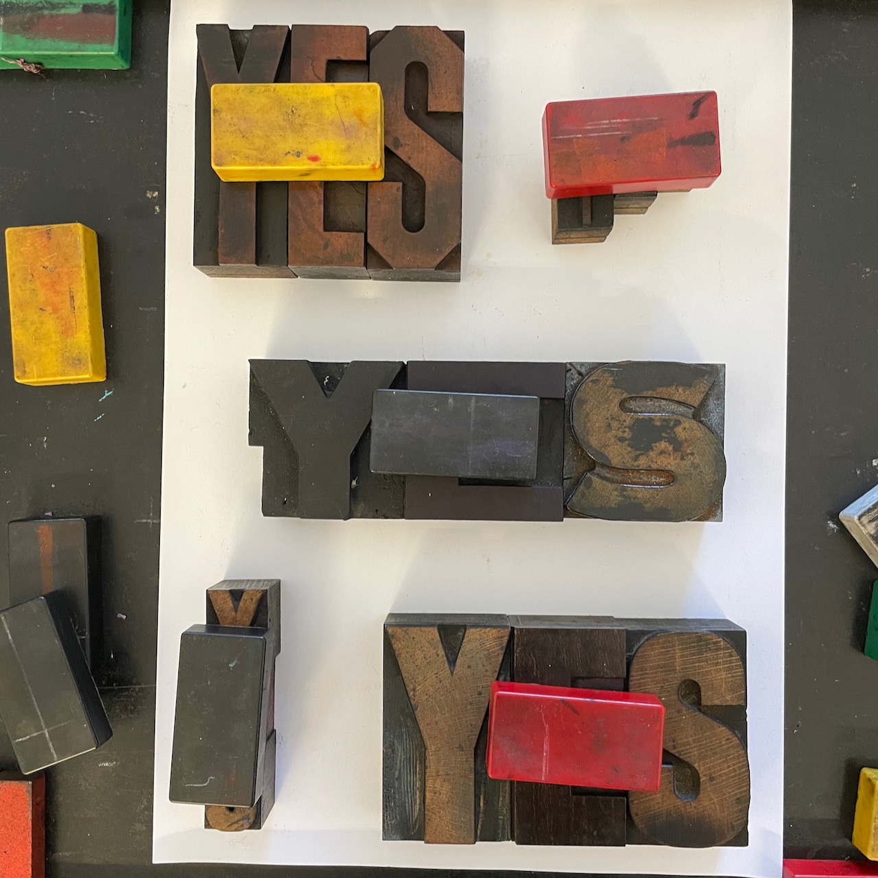
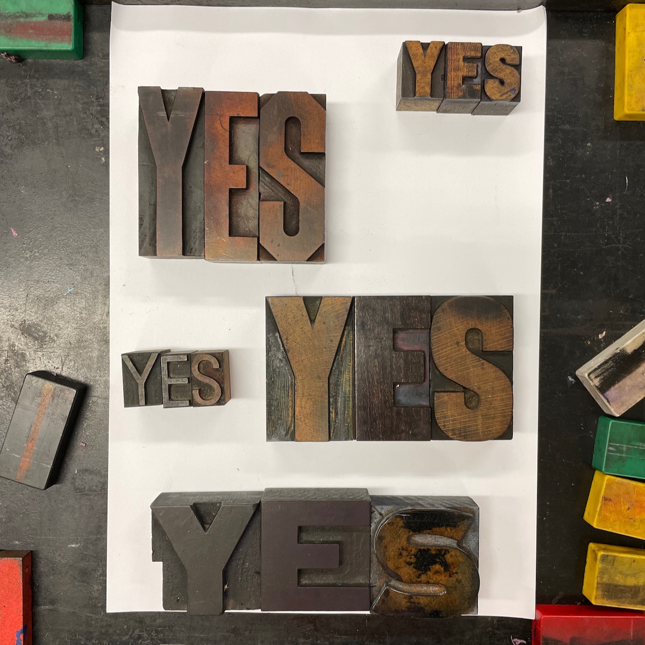
Here's a bunch of layouts which haven't really gone anywhere yet.

Like most things I seem to be trying at the moment, after plenty of action and completion of things in readiness for markets in Scotland later in the year, I am tinkering around the edges of things with nothing yet being 'done'. 

I feel fortunate to have the technology on my phone that lets me 'flip' photos so easily; enabling me to see how type would look like if it was printed. Much less messy than inking and proofing. And so much quicker than setting it all, locking it all up and then undoing it.

1. My first thought with this was that a small lead-in on the top left would work. But no.


2. So I moved it over to the right and took it a bit higher and balanced that by moving the 'centre panel' around a bit.


3. Then I thought that the big yet short stumpy YES should be in the middle, with a larger YES to anchor the bottom, which would mean also moving the smaller YES to down to the 'bottom panel' And the top right YES seemed to need to be lower down the page. 


4. Thinking the thinner small YES would be better at the top, and the slightly heavier small YES would work better at the bottom.


5. Because I was less than accurate placing the small thin YES above, I then thought about what happened if I deliberately stepped it? And ran the other small YES top to bottom rather than left to right?


6. Looking back, I probably should have tried to step it upwards, instead I went and got another thinner YES and tucked it in.


7. And then moved it out to the right for better balance.


At this point I sort of gave up and went away to think about it all and come up with a final arrangement to proof. Still waiting for that to happen!

Here are some of the things that are going through my head:

I think I probably need to sort the three large YES blocks into positions I am happy with, then work out how best to fill those smaller spaces that are left.

I am beginning to wonder if I should 'justify' the three large blocks - although I think that would mean the spaces left are too small to work with.

I always prefer to have an uneven number of elements so think I will get rid of the skinny YES and revert back to five. Although it could sit atop the other thin YES like a building block?

I am not sure that the vertical reading of the smaller YES actually works.

I think I should see what it looks like to step the small YES upwards in the top right - it might be the only point of interest/difference that it needs (imagining 4. with a proper step up).

I am thinking of printing in black, red and yellow - the colours of the Indigenous flag - and so maybe there doesn't need to be heaps of variation as the colours may offer that?

It could be said that I sometimes end up overthinking things!

And yes, after staring at all of these images for so long, the S in the bottom large YES is definitely upside down!

Tuesday, March 15, 2022

NO to war...

 As part of an online letterpress poster call out (check out instagram #letterpressunited); we have both printed small posters saying No to war.  Barry's can be seen here.

Simple instructions - print the three words, in black, in your own language, and include your name and country.

I went for our beautiful Italian wood type Amalia (in both 30 and 25 cicero sizes) on soft Japanese papers.


I think this was my favourite of the paper -  loving that soft deckled edge at the top.


A much brighter whiter paper.


The bunch I printed.


It was interesting to me that I went for softness. The typeface Amelia has an Art Nouveau feel to it; curves with no really sharp edges .  The papers too were soft and light.  Perhaps  the materiality of my message was actually saying Yes to peace and kindness.

On a recent walk to town we passed a building called Banksia House - it has within it several shops and service - telecoms, real estate, dentist etc.

Well-named as it is planted out with Banksias and we stopped to look at the variety and the different stages of them and here's a few.


We really do have some extraordinary native flowers in our country.

Sunday, January 2, 2022

2021 in Review

 I have found over the years that stopping to reflect on the year that passed; and pausing to consider the work I have made is a really helpful reminder and record.  Especially now when time has become such a strange concept;  seemingly elastic and shape-shifting.

I admit that Covid has left me often unmoored with regards time; the markers I can usually pin things down to have moved, disappeared, or happened at unusual times, and I have had to work hard to recall what work was made this year rather than last.  But I did and I enjoyed it as ever - it felt like greeting some long lost friends as I went along the way!

Here are my Top 10 things I made this year - things that I love, things I am proud of, things that make me smile, things that matter to me and things  I am simply happy to have out in the world. They appear alphabetically rather than in any order of merit.

1. The Angels

This commission made me smile.  I love the nod to old fashioned peg dolls; I love how they link to friendships and I was really happy that each piece ended up being individual.  Another one is underway to acknowledge the latest member of the team.  For some of the drama in the making see here.


2. Feminist Postcards

I love these cards. Such small yet powerful reminders of our need for change. Siblings to my larger posters, they gathered together really well in this set of 7. I wrote about them here.


3. For Mary

As part of a beautiful birthday commission for a friend.  This wee book offers reminders of home; and offers words of remembering too. It was such an honour...


4. Friendship Unfurls

The Red Thread exhibition offered me so many opportunities to play with notions of female friends; holding and connecting.  This wee book, in combination with Barry, was an absolute favourite. It sat so well in the hand; it gently unfurled and you could pop it in your pocket and carry it with you. It now lives at the home of a friend. 


5. Hear Me Roar

After having made my individual feminist posters through the year; I brought them all together in a book, which makes quite the statement.  It feels good to have them all together, bravely and boldly telling it how it is.


6. Llorac

The companion piece to the book at number 2; this beautiful work formed part of the birthday commission.  It spoke to the heart and was welcomed with love. Such a lovely lovely thing to have been  part of.


7. Morningtide

It's funny how some thighs are lovely, yet never really get loved.  I really enjoyed making this series of works. There are 42 in the series and they bring together crisp and beautiful digital printing with hand set traditional letterpress. I like the combo and I like the images and the words and yet they don't seem to resonate with too many other folk! 


8. Old Friends

This is the piece that got me kick-started and headed in a good direction for The Red Thread.  The story of the returned rusty tin is here and I once more offer my gratitude to Pauline Prior-Pitt who generously loaned me her words. 


9. Ongoing Friendship

Another of my Red Thread works - I love the possibility of a continuing and shared story between friends with these unbound books.


10. Pocket Book

A sibling to my original poster Pockets are Political, I love this book. It is a slim volume packed with good thoughts about pockets and women's clothes and has always got a lot of nods of recognition as women read it.


Thanks as ever for coming along on the ride looking back over the year that was. It helped me remember that there were many beautiful things and moments of magic and that there will be again. 

An honourable mention must got to my Covid hankies.  They are not yet complete and so I will roll them over into 2022; but I must say they occupied an enormous amount of time and thinking this year and I do love them so.