Sunday, April 14, 2019

APT 9 Part 1

The Asia Pacific Triennial of Contemporary Art (APT) has been on show at the Gallery of Modern Art (GOMA) in Brisbane since late last year.  Despite thinking of it often, we hadn't managed a trip to the city to view it, until today. I realised a wee while ago that it was closing soon so we had to get organised and Sunday was a free-ish day, so we had a family lunch and delivery of kitchen items, but first of all we went to GOMA to see APT9.

There was only one piece I knew I really wanted to see. Jonathon Jones' untitled (giran) 2018.

We arrived as soon as the gallery opened and I asked a security person where we would find it and headed straight there.  I knew that if I saw nothing else I needed to see this.  And we did. And it was everything.

 "Understanding wind is an important part of understanding country. Winds bring change, knowledge and new ideas to those prepared to listen". Jones writes.


In collaboration with Dr Uncle Stan Grant Snr AM, the work suggests a map of wind currents, of birds circling above, almost like the murmurations of starlings seen in the UK. A coordinated dance in the skies.

The key elements are traditional tools, and bound to each tool with hand made string is a small bundle of feathers. Many people answered Jones' call for feather to incorporate in the work, and they were delivered to him from all over the country.

Emu egg spoons, mussel shell scrapers, weaving start, bone awls, wooden spear points and stone knives make up the work, incorporating almost two thousand individually, hand crafted pieces.


And here it is in a panoramic shot which give you a sense of it, yet still not full ness of it.


It was accompanied by a sound scape - the whistle of the wind and of wings beating; the language of the Wiradjuri people, the air moving, bird song, breath...

It was exquisite.

ADDENDUM: Here is a link to a video (17 minutes) of Jonathon Jones speaking about this work.

The rest of the gallery had many moments of magic, but nothing moved me quite as much as this work. Here are some others.

Detail of work by Pannaphan Yodmanee.


Astonishing weaving and a bank of shells used for currency. Gunantuna (Tolai People) led by Gideon Kakabin.


A bomb which held hundreds of bombs and has been recovered in Laos, now being used for functional beauty - a garden bed from land mines. Lie of the Land by Bounpaul Photyzan.


Detail from Shinro Ohtake's Time Memory/Nairobi constructed from packing materials that arrived in his mail.


The beauty of dyed pandanus weavings of dilly bags. Mindirr by Margaret Rarru Garrawurra and Helen Ganalmirriwuy Garrawurra.


And a shadow from one of Louisa Humphry's headdress works.


On Tuesday I will share another favourite work and the colourful pieces that I enjoyed - this one was all about the muted, soft and soulful colourings.

Thursday, April 11, 2019

Thursday Thoughts...

“When you are deep into a book, it’s for yourself alone. But once you’ve finished, if it’s any good, you want to share it with others – rehearse the story, assess the characters, discuss what makes the book special…first engage, in private; then exchange in public”. 

Blake Morrison

This quote really struck a note today after I had asked a fellow book group member had she finished this month's book.

The book is challenging and difficult and confronting - the memoir Educated by Tara Westover.  Anybody who has read it probably knows that it  is a book that almost demands that you talk about it afterwards.

I was a bit sad that she hadn't finished it yet, so I couldn't fully share it with her, but I know that next week's gathering will be a powerhouse of a meeting.

I love both parts of the quote - the first bit where it is reminiscent of being so deep in a book, engulfed almost and completely immersed as you dive in and read it. And the second part of it where you rise up, pop your head above the water, look around and want to share it with others.

At times you almost actually need to share it with others, to process it, to exclaim in joy or wonder; to celebrate the magnificence of the writing; the magic of the words put together just so, to marvel at the resilience of individuals...or to condemn the brutality or the unforgivable behaviour or the awfulness of the characters...

Blake Morrison gets it so right - firstly engaging in private and then exchanging in public - these feel like the hallmarks of a good book.


Tuesday, April 9, 2019

Playing with pockets

I have mentioned my current obsession with pockets in women's clothing, and spent some time on the weekend playing around with printing and stitching.  Sometimes studio time can just be fun, and that's how Sunday was.

It was a beautiful sunny day and we had no other commitments so I could potter and play to my heart's content.

So I did.

Here are some fleeting images of the fun.

Playing around with gift tags...


Some sewing with the sewing machine on 300gsm paper...

Luckily just a trial given those inky finger marks all over!


Mucking about trying to work out the size of the pockets to sew - took me three goes to get it down.  The size of the paper changed as we went along as well, but it was definitely worth doing.  Now I have pockets templates for future use I think.


And as I said on Instagram - it's always a good day when you're printing purple!


Even cleaning up makes me happy!

Sunday, April 7, 2019

Many a dead end...

I am fortunate to have been selected to to participate in a fairly prestigious exhibition alongside 25 Australian printmakers and 40professional artist members of the Kyoto Hanga Executive from western Japan. (for details see works on show here)

There is no theme, no size restriction and either 2D or 3D work is possible.

It sounds wonderfully freeing and all things are possible doesn't it?  Instead I have observed how challenging it is to work into a void.

I think perhaps the challenge has been added to by the fact that I had factored in needing to do have done the work by August (the show is in September) BUT because it is a joint show with Japanese printmakers, and the catalogue is going to be printed in both English and Japanese, and the printing is a complicated affair of high gloss stuff, we actually need to provide some words including a title by 15 April, and then hi res images all need to be provided by 1 June.

So this kind of mucked with how my brain had set this one aside for some pondering, back of mind perusal and perambulation - and brought it up front and centre and forced me to come up with something!

It has become clear that this is not my favourite way of doing things.

But still.

Under pressure I tried a myriad of ideas and ways to produce something the would be worthy, and I present for you my many rabbit holes and dead ends along the way.  That is not to say that I have a resolution now - but I am headed in a completely different direction and am quietly hopeful...

In an effort to be technical, I pondered ripples of peace...and faffed about trying to see if I could print lead type in semi circles without much support other than by dipping the type in candle wax and attaching it to the base of the proofing press.


The answer is clear...


I was so busy trying to do clever technical things I ended up writing myself a note...


 I thought I could then go simple - just piling up some wood type.


The idea behind this one was hugs and kisses, but it ended up feeling bit trite for a serious show, so I let that one go as well.

Although it will go somewhere sometime as I kind of like it!


I returned to the notion of here and there - a book about the cottage in Scotland and our home here in Maleny.

Having designed and worked out the layout, I realised it would turn out to be a tiny book coming out of a single sheet of paper - only about 14cm high by about 5 cm wide; and I felt that it would look a bit inconsequential amongst other works (the maximum is 60cm x 60cm which is a good size piece of paper).

For some reason I then thought of cubes.  Printing the information on two cubes that you could turn around and see the different elements of the two places.

I started with wood type tests - the postcode in Scotland.


But then tried a few templates of cubes and where and how to print, this time using a consistent lead typeface.


One element is the peace dove - we have seven at the cottage and around 21 in Maleny, so I was planning to emboss them on one panel after all the other printing.


See how tricky I kept getting?  Clearly still failing to pay attention to my own earlier advice of working out what and then how. I was stuck on being clever and complex.  I guess I was feeling I had to do something pretty special when I was amongst so many talented and real printmakers.


I looked at this cube made up and thought it was very dull - and perhaps a constant theme on each panel might help, so I went and printed squares on the etching press; then back to print letter press on the proofing press.

Wootha is the actual name of the locality where we live.


These are our latitude and longitude.


Our Maleny/Wootha postcode.


And still it just wasn't working - not me; trying too hard, why was I trying to say this? why did I choose this form? Honestly!


And so I dropped this idea as well.

And then early one morning when I couldn't sleep a little idea popped into my head and I thought - ahhh, now that might be it...

Stay tuned to see if we have a solution or just another dead end. 

Thursday, April 4, 2019

Thursday Thoughts...

There are only two feelings. 
Love and fear. 
There are only two languages. 
Love and fear. 
There are only two activities. 
Love and fear. 
There are only two motives, two procedures, two frameworks, two results. 
Love and fear. 
Love and fear. 

Michael Leunig

I came across these words many years ago and they have held me in good stead ever since.  At those moments when I am angry, or observing somebody's unnecessary behaviour; when friends do odd things or when somebody does or says something hurtful, I remember them.

I go back and think that we operate from only two bases - either love or fear.  Sometimes my anger is out of love, of empathy, of care; sometimes it is out of fear.

I try to take a moment to work out which one it is, and then dig deeper if needed.

When folk are hurtful I try to look for what they are frightened of; what risk or danger do they perceive?

And I think it truly can be this simple.

Love and Fear.

Let's go for love.


During our summer of landscaping I found this rock in our 'rock river'.  How could it be so perfectly shaped?

It welcomes folk at our door. Love.

Tuesday, April 2, 2019

Light and Love

In the spirit of good making, this book continued along without drama.  It came into being with all kind spirits sitting alongside me as I made and in the end, it is a small and precious thing.

I changed my mind on the colour of the gold.  My first choice was a bright and yellow gold for light and a softer silver for love.

I felt the silver disappeared too much into the paper and the the yellow as a bit bright and harsh.  Lucky for me I had some FineTec Lunar Gold - which is gentler and sits beautifully on the paper - says enough without shouting.  So I used it for both Light and love.


One of the lovely things about this book is I got to use some beautiful soft black leather gifted to me by a friend.  Her mum had made her a fabulous leather skirt many years ago and whilst cleaning up her place her mum couldn't bear to throw it away, so my fried wondered if I could use it. Oh yes please.

The covers are stitched to the pages, but have this beautifully simple and soft band that just holds it together.

I wanted it to feel protected, and yet accessible.  I didn't want to have to fight to get into the book; but I also didn't want to leave it utterly vulnerable.  I know. The hours I sometimes spend pondering these things.


But I love this resolution.

I used simple calligraphy throughout. Larger for the key words, smaller for the others.


Ruling pen as a contrast -  the energy of the lettering, the style and the colour give hope.


The papers that had been sitting in the studio for years, have suddenly come to life in the honouring of these words.  The soft Japanese paper from our last visit to Tatebayashi  works so beautifully, and give a moment's pause as you begin and as you finish.

Quietly and softly the words remind us of Light and Love.

The book will be on display at the Compassion Exhibition inNambour in June.

Sunday, March 31, 2019

Darkness and Light

Martin Luther King Jr. once said:

"Darkness cannot drive out darkness; only light can do that. 
 Hate cannot drive out hate; only love can do that".

These words reached out to me after the terrible shootings at the two mosques in Christchurch New Zealand. Helpless and stunned as I was, I somehow still felt I needed to respond in a small way. I started to make a book.

A small book, a book made with calligraphy, and using materials from dear friends.  Somehow holding love and beauty together felt necessary if we are to try and overcome the darkness that pervades.

So I sat and tested out how it might work.

And it was interesting how the process flowed. How the need to make this wee book was enabled and supported by the spirit of making.  Some days can be hard and you feel like everything you try ends up wrong. Not with this one, it went along the path and made significant progress in just a day.

And that is no mean achievement in my world of very slow making.

Testing script ideas, colours and pens.


Finding the metallic ink would not flow happily through the metal nib and onto the soft paper. The metal nibs just kept pulling the top layer of paper off. Not good.


So I turned to the ruling pen; and after a few goes, seems to get the thin lines I was after.


My view when I broke for lunch.


My first draft on white paper.


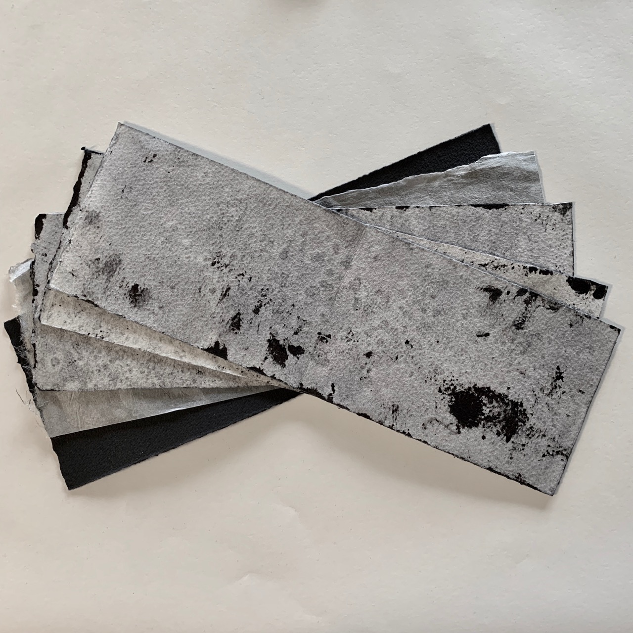
All the pages cut.

Such lovely edges.


So a lot of progress was made. Now to sit quietly and write...