I spent some time having a play afternoon with a friend in the studio - getting her to print her first wood type. We had such fun and my brain was going in this direction and that thinking about things to do and try next.
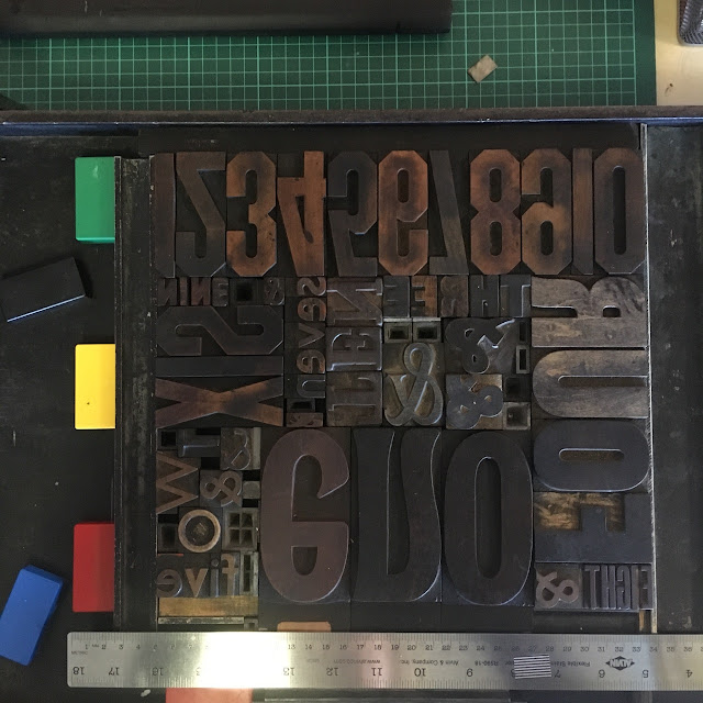
So the next day, I thought I'd try a mash up sampler thingy - trying out all the wood type we have as sets, and just the numbers 1-10.
For some reason I just love the jigsaw puzzle nature of letterpress and the problem solving of layout and positioning that comes with it. It took me quite a while to make a proper shape of the type. I hadn't known what I was going for, it evolved and became clearer that I didn't really want many 'holes' in it; I wanted it pretty dense.
I filled the gaps with ampersands, because...ampersands!
Anyone who knows my work knows I am not known for my use of varied and vibrant colours - but again, I thought I want to try a multi colour print and so I did.
I thought they'd work well together.
Starting in the middle and with the gold, I inked my way around the set up.
I was somewhat concerned when the yellow appeared so lime green, but I thought just go with it.
In case like me, you didn't notice it in the set up - here's the first print - for proofing of course! I had moved those letters down and turned them around, but forgotten to switch them around when I did. Always good to see where the different heights of type are not inking etc, so back we go...
Properly inked and set up this time.
And lots of lovely trials done! I am really happy with them on different papers and seeing the results of my problem solving.
As I went to clean up, I thought I should do some prints to remove ink from the type. So I did some diagonal masking and printed; then I turned the paper around and printed again. Quite a nice effect.


F - great creative play - I particularly like the last print - there and not there. B
ReplyDeleteThanks B, yes that last one is the most interesting in a way! I think there is lots to do with masking...
DeleteBeing a fan of asemic text, I quite agree with Barry ... the last one is definitely a keeper. I especially like how the paper carries the impression of the masked characters
ReplyDeleteThanks Liz - so interesting how the faintest of indentations can still be seen - and I really do like the unknown nature of the text, so exploring will happen for sure!
Deletelove the photo of rolling the different colours out!
ReplyDeleteMe too Mo - that was quite a lot of fun!
DeleteHa ha...eno. I love the arrangement and your departure into bright colors.
ReplyDeleteI know...Eno! It was so easily done and so silly once I saw it; but once more lessons learnt. It was fun to try and design something around just the words for numbers - no real content just the look of it - so time well spent. Go well.
DeleteOh my goodness how fun and beautiful and so uniquely F. Love the results and love the thought of your new desk floating I the sky for creative inspiration. xxx
ReplyDeleteThanks T - it wa indeed a bundle of fun (inky and messy fun, but fun!). I like the idea of me and my new desk floating in the sky - am headed there now!
DeleteA very different venture into the colour spectrum. Like Barry - enjoy the text that is there and yet not :-)
ReplyDeleteI know I know! What happened there? Still, a little push or nudge is needed - if you want to try multi colour printing, then you have to use multiple colours! I think have all landed in favour of the there and not there print...love it!
Delete