Thursday, June 29, 2023

Thursday Thoughts...

“The most demanding part of living a lifetime as an artist is the strict discipline of forcing oneself to work steadfastly along the nerve of one’s own most intimate sensitivity.” 

Anne Truitt.

Somehow for me, these words take you to the vulnerability and exposure that making art and showing it can create. They speak too of discipline, of investigation, of going deeply into difficult territory at times to express something.

Whilst not all art is about difficult subjects, I think that what she says suggests that by working with what cheers you, or brings you joy also takes persistence to investigate and express. That showing and sharing these things can also be demanding.

It seems to me as if determination and persistence are key for her; and that she suggests it is demanding to continue to work in this manner, unflinching and not turning away from your sensitivities.


Ireland, 2008, no other recorded detail. 

Tuesday, June 27, 2023

Watercolour pebbles

 After doing my swatches and starting my first pebble circle, I let it dry and then went and worked back into the pebbles.

First of all I rubbed out the outline.


Then I began to work over the top of the initial wash, oftentimes leaving a thin, lighter line like a stripy pebble might have. Again, this was from the video.


For a non-painter I was pretty happy with how this worked out, and definitely was getting better by the end.


The next day I turned my mind and my brushes to a warmer palette and created the same size circle and once more began to paint pebbles.

This time I focussed on not working from the outside in and ending up with small holes near each other. I think I got the balance better here; but some pebbles still appear a tad contrived.

Waiting to dry.


Again, I rubbed out the pencil outline and over-worked the pebbles to create a few more stripy ones. I think it is amazing how the lines really lift the work and make it much more interesting.


I also think I got some interesting colour-blended tones across the pebbles; again more interesting.


I need to go back to the video and see what else I could have done - something about shadows I think!

Here are the two circles on a sheet of A4 watercolour paper - good samples and reminders.

Sunday, June 25, 2023

Swatches

 Some friends and I are beginning to talk about a possible exhibition and thinking along the lines of pebbles and stones, maybe rocks and boulders.

Once I get an idea in my head I oftentimes race ahead and get to the end, in my head.  I am trying this time to sit with the idea of pebbles and stones and not rush headlong into deciding what the finished pieces will look like already.

Slow.

Down.

I have slowed myself down by thinking about colours and watercolours and realising yet again, that I know very little about colour theory, and so should probably spend some time trying to see what sort of stone-pebble colours one can create with the watercolours I have on hand.

However, the first step ended up being, go buy a tube of Payne's Grey. I love this colour so much and have it in various inks and pencils; but not in my watercolour set. I thought it would be an important base for pebble and stone colours.

I set about doing swatches of the colours in my set, as they mixed with different strengths of Payne's Grey.

Unaccustomed as I am, I realised I had really not done the colours justice at all - they had all ended up looking pretty much a shade of Payne's Grey. So much to learn.


So I went and repeated the trials and got better results. Use more water, and less Payne's Grey.


This is what the swatch page looked like at the end. The second versions really gave me some lovely tones to look at and explore.


The closer I looked, the more I loved the organic shapes the swatches made. Exactly the sorts of marks I might hope to make, but could never do if I was trying. The way the darker pigment hugs the outline...


I had watched this video here, and decided to paint some pebbles in a circle. Here is the first circle I painted, still waiting to dry.


I ended up being quite annoyed by the fact I stuck those two small lozenge pebbles near the middle and in the same direction - I was looking at the blank space rather than the whole design. Never mind. That's why we practice right?

As we walked into town on Saturday, we came across this glorious orange buddlia - the soft green of the foliage against the weathered timber, with the pop of colour was an eye delight!


Thursday, June 22, 2023

Thursday Thoughts...

"Books may well be the only true magic." 

Alice Hoffman

There are any number of definitions magic, and where they include references to power or influence over things due to a supernatural force, I am not sure that books are necessarily doing that.  The power and influence that books wield seems to me to be due more to force of an individual's imagination, skill and knowledge.

But then who knows? Maybe writers are guided by a supernatural force?

Definitions that suggest magic is something that seems to cast a spell (MW dictionary) gets closer to the mark for me. I can attest to having been 'under the spell' of a good book. That feeling of returning from some other place, some other time as I close the chapter or the book and re-integrate myself into the world around me. That definitely feels a bit spell-bound.

As for being the only true magic; I am always wary of only; and of the combination only true

I will however unashamedly sign up for books being magic.


I know books are magic, but so are wintery landscapes...

New York City, 2013.


Sunday, June 18, 2023

Shadow

 I have been laid low by a violent episode of food poisoning for a few days and have barely thought about art, let alone had the strength to undertake any.

As gentle and slow days were the go, I noticed shadows. 

Shadows of flowers, of grasses, of plants and of me.

These grasses on the kitchen bench with morning sun...


A quiet walk into town this morning and this marvellous, citrus-green against steel grey blue, and its shadows.


Me walking to the studio pre-food poisoning.

I am on the mend and feeling a bit brighter, but goodness me it packed a punch!


Thursday, June 15, 2023

Thursday Thoughts...

“Walking itself is the intentional act closest to the unwilled rhythms of the body, to breathing and the beating of the heart. It strikes a delicate balance between working and idling, being and doing. It is a bodily labor that produces nothing but thoughts, experiences, arrivals” 

Rebecca Solnit

I am pretty sure there are tomes written about walking - the meditative nature of it, the benefits of it, what happens when we pack up a life and simply walk towards something; or away from something.

With these words Ms Solnit has me thinking about the rhythm of walking and how it approximates the breath and beats of our bodies. That notion rings true to me and deep within I recognise something.  

Her description of its purposefulness and its purposelessness as a balancing act is also spot on. The older I get, the more I realise that one of our jobs is to understand and to hold differing thoughts, notions and experiences. To learn and accept the two differing things can be true at the same time.

With walking it does feel like working and idling, being and doing. Such a lovely way to think about the walks we do daily.


Tuesday, June 13, 2023

Answering Yes

So I went back into the studio to try and sort my head about how best to layout the YES posters. Click here if you want to read the ramblings I have previously undertaken around these...

I ended up going with the stepped small YES in the top right and kept the rest pretty much as it was. 


The next challenge was trying to work out how to print the colours of red, black and yellow - which YES would be which colour?

I didn't want all the large YES blacks to be a single colour, so I tried a diagonal.


I tried two red and two yellow and just couldn't work out how to make them balanced well.


And then I hit on the idea of printing the three bands as they appear on the Aboriginal flag - black at the top, yellow circle through the middle, and red on the bottom.


At which point I left the studio to return another day. 


When I went back, I moved the magnets out of the way and started to ink up. It was bit of a weird printing day - the ink was thick and sticky and everything was a bit hit and miss. But that doesn't explain why I inked up in the wrong order, didn't notice and just printed. Red, yellow, black, rather than black, yellow, red.


So the first 20 are like this. 


In the end I think it's OK because the colours are indicative; it's not actually a flag and I am pretty sure the general feel of the message still gets across. If I print more I will print them in the order of the flag.


Sunday, June 11, 2023

Testing ideas

 As mentioned previously, I seem to be in a phase of testing and trying and not so much into completion. Nevertheless, these times are always good for just wondering might happen? what might work? Could I do this? Could this become something?

And so it was as I tested whether I had the right glue for attaching pebbles to paper. I went down tot he studio late one afternoon and glued the pebble into position and then left it to dry overnight. Mostly so I wouldn't be tempted to to keep checking if it was working!

I returned to the studio the next morning to discover that yay - the pebble had held!  Superglue was the glue of choice in case you are interested.


I kind of like these times of no deadlines or real pressure as my mind lights on something and I can just do it. So it was with this delightful stack of Koh I Noor watercolour palettes I had purchased a year or so ago. I realised I had no idea what the colours were really like so thought I might do some colour swatches. I was in a circular mood, so grabbed some scraps and cut them into circles, then divided the circles into six and began to paint. I also figured the circles might sit inside each palette.


But after they were all finished I was playing around with them and seeing if they might balance standing together.


Which they did. And I wondered what if they stood next to each other? Teetered together would be more apt.


And then I thought - would they make a book? So I hinged some tape on the back of them, and yes, they did hold.


And in the end I saw butterflies... 


Such lovely play and discovery and now I have all the swatches in a folded, stacked 'book' of sorts.

Thursday, June 8, 2023

Thursday Thoughts...

“Pare down to the essence, but don't remove the poetry.” 

Leonard Koren

I think these words are poetic in themselves. They encourage us to narrow things, to reduce things, to allow things to simply be at or in or of their essence, which I find is often how I do things.

The trick tho is in the last part where they make you realise that sometimes paring back can leave you with nothing of interest; nothing with heart; nothing with poetry still within it. At times like that the work is empty, stagnant, lifeless.

Always make sure the poetry remains...


Pebble ripples...

Tuesday, June 6, 2023

Playing around with YES

 Our country is holding a referendum in October seeking to amend our Constitution to recognise Indigenous Australians; and to create an Indigenous Voice to Parliament, to enable Aboriginal people to provide advice to Parliament on matters that directly affect them.

I will be voting YES and have begun to think about ways to promote the YES vote.

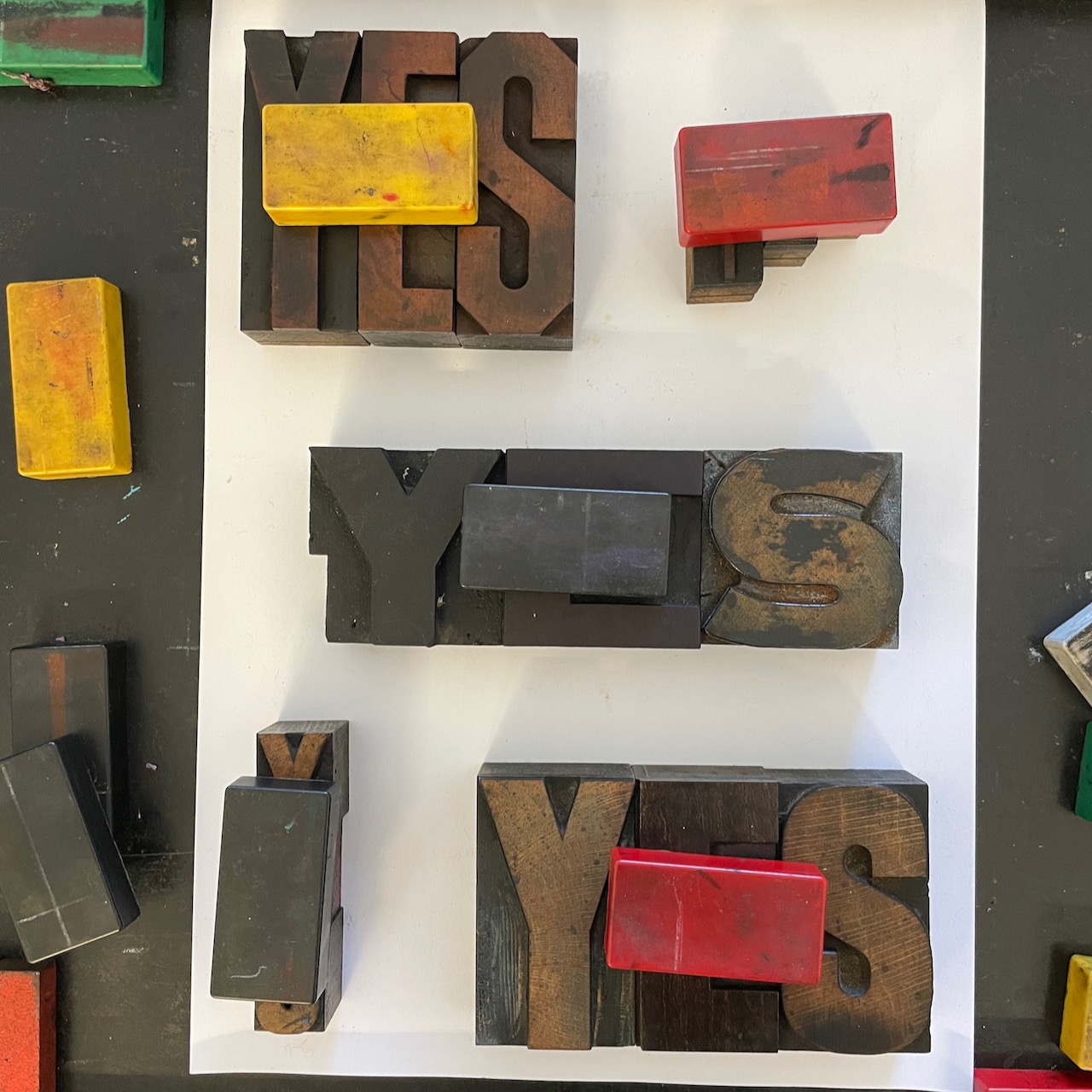
On Sunday I played around with some wood type to see if I could print a few small A4 posters.

Here's a bunch of layouts which haven't really gone anywhere yet.

Like most things I seem to be trying at the moment, after plenty of action and completion of things in readiness for markets in Scotland later in the year, I am tinkering around the edges of things with nothing yet being 'done'. 

I feel fortunate to have the technology on my phone that lets me 'flip' photos so easily; enabling me to see how type would look like if it was printed. Much less messy than inking and proofing. And so much quicker than setting it all, locking it all up and then undoing it.

1. My first thought with this was that a small lead-in on the top left would work. But no.


2. So I moved it over to the right and took it a bit higher and balanced that by moving the 'centre panel' around a bit.


3. Then I thought that the big yet short stumpy YES should be in the middle, with a larger YES to anchor the bottom, which would mean also moving the smaller YES to down to the 'bottom panel' And the top right YES seemed to need to be lower down the page. 


4. Thinking the thinner small YES would be better at the top, and the slightly heavier small YES would work better at the bottom.


5. Because I was less than accurate placing the small thin YES above, I then thought about what happened if I deliberately stepped it? And ran the other small YES top to bottom rather than left to right?


6. Looking back, I probably should have tried to step it upwards, instead I went and got another thinner YES and tucked it in.


7. And then moved it out to the right for better balance.


At this point I sort of gave up and went away to think about it all and come up with a final arrangement to proof. Still waiting for that to happen!

Here are some of the things that are going through my head:

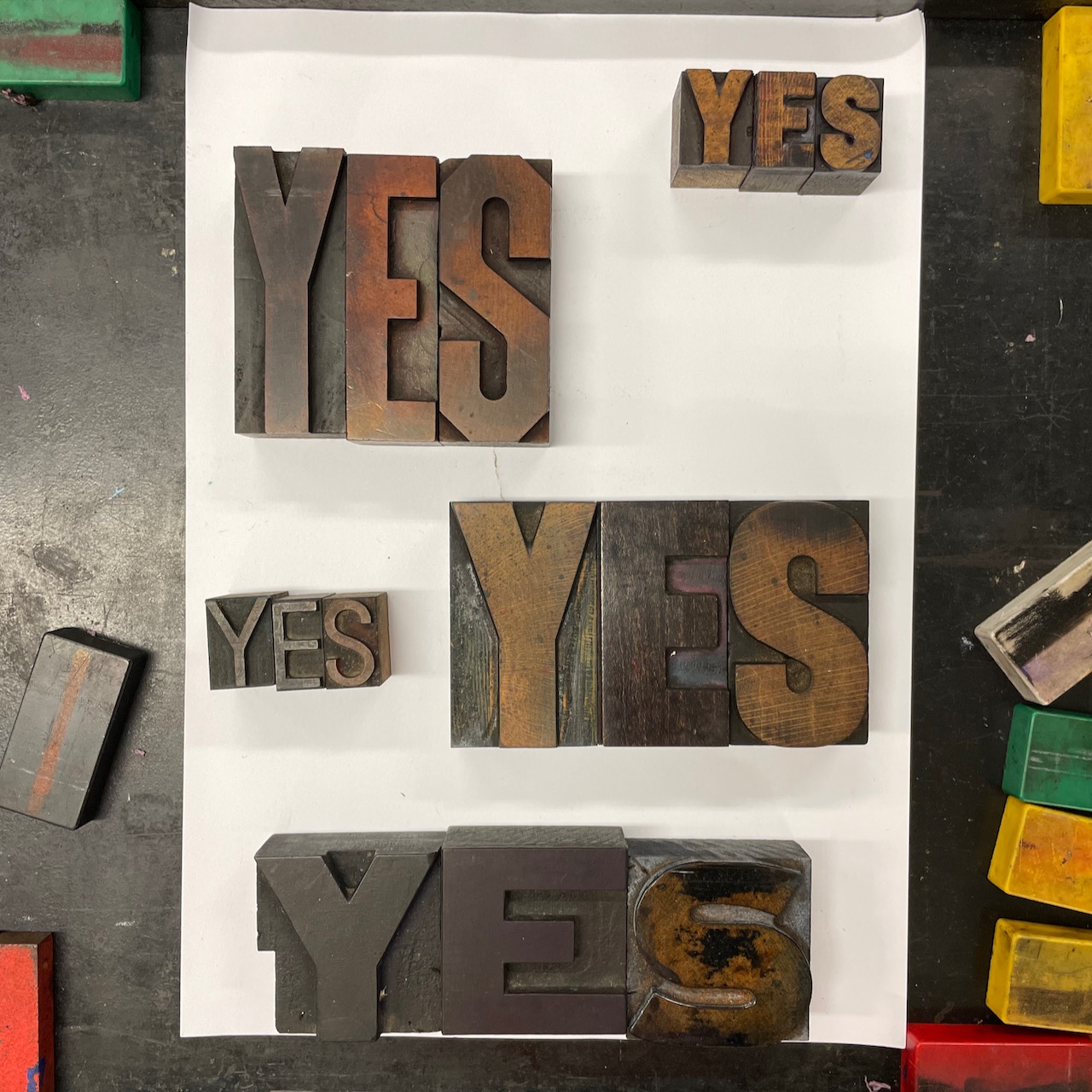
I think I probably need to sort the three large YES blocks into positions I am happy with, then work out how best to fill those smaller spaces that are left.

I am beginning to wonder if I should 'justify' the three large blocks - although I think that would mean the spaces left are too small to work with.

I always prefer to have an uneven number of elements so think I will get rid of the skinny YES and revert back to five. Although it could sit atop the other thin YES like a building block?

I am not sure that the vertical reading of the smaller YES actually works.

I think I should see what it looks like to step the small YES upwards in the top right - it might be the only point of interest/difference that it needs (imagining 4. with a proper step up).

I am thinking of printing in black, red and yellow - the colours of the Indigenous flag - and so maybe there doesn't need to be heaps of variation as the colours may offer that?

It could be said that I sometimes end up overthinking things!

And yes, after staring at all of these images for so long, the S in the bottom large YES is definitely upside down!