Showing posts with label Deckled Edge Press. Show all posts

Tuesday, October 12, 2021

Updating 1

 Every now and again, one realises that things need updating.  Recently we revised and re-built our websites - yay.  We updated the online shopping thing - yay.  And as we did this, we realised the photographs of us were well, to put it mildly, rather out of date.  We think they might have been taken in 2014; and 7 years on we are both a tad older and different looking.  

We ended up getting  a package of professional photographs taken by Megan Gill Photography.  We asked for individual photos of us (some that were arty; some that were more professional) and also some joint photographs.

We were thrilled with them, and today we have updated our websites and uploaded the short videos she took of us. Mine is here...

Here are a few of them - so happy with the way they reflect the different bits and pieces of who we are...


You can find how we used them here on my website; and over at DEP as well. They are black and white there - nice!

In addition to updating our imagery, we needed to update our descriptors of who we are and what we do.  Never an easy task.

Despite the pressure of learning new skills; working through the complex behind the schemes worlds of website interfaces and the like, it was good to stop and reflect on these things.  But more on that later...

I just love how this contemporary photo reflects the same joy as this very old photo - me and books!


Sunday, May 23, 2021

The week that was...

 We had a great visit to Melbourne - a fabulous few days of being inspired at the Communities in Control Conference; as well as spending time together with dear friends and eating together and wandering the streets. Some places and some times fill you up, and time spent at the conference, as ever, renewed my spirit.

Our Pop Up Poster shop went well and we chatted social justice and women's issues with many a participant.  A few commissions came our way as well, and more Go Girl tea towels are about to hit the press!!!

One of my favourite wall signs near where we stayed. How I love artists and street art.


Home on Wednesday, to find that the ikebana arrangement I made at the workshop last Saturday was holding strong. Our good friend Tory had arranged for the wife of the Japanese Consulate in Brisbane, Hiromi Tanaka, to do an Ikebana demonstration (she is a Master) and for us all to then try our hands. As you can see a gorgeous gathering, and we all learned a lot.  It made us look at flowers and negative space so very differently. Thanks to John G for the group shot.


On  Thursday I baked bread. More aligned to to the rock family than the bread family, but it tasted good.


On Thursday night we attended a vigil for victims of domestic abuse.


On Saturday I baked more bread. Much better, but more trials to come!


A cornucopia of life - varied and full this week.  Friday and Sunday were spent in the studio with bits of this and bits of that.  Not as much focus as I would have liked but time to be gentle on myself and let things settle into place. 

Tuesday, September 29, 2020

An inventory of sorts...

 The more time I spend in the studio space, sharing the letterpress with others and explaining how things work, the more I realise don't actually have a huge bank of knowledge about our presses.

It's not something I have ever sat down to study; nor is it something I have people on tap I can just ask a million questions of.

I belong to a couple of letterpress groups and every now and again enter the conversations by asking the dumb questions; and they are always so helpful.  From one of these groups I have learned that there are three different sorts of Adana Table Top presses.

So I decided in my spare moments I would try to assess which ones we have; and am beginning to try and develop an inventory of sorts.

Here are just some of the photos I have taken in an effort to differentiate between them.  

Comparing the clamps that hold the baseline bar (my own, not a technical, term) in place begins the process.


And the pieces/things that hold the rollers - a few variations here.


The rails on the rollers...


And quite a few other things to look for - how many parts the body was cast in; if there are bolts in the base for attaching to a workstation - and a few other things I am enjoying trying to discover. Who knew?

I think I have worked out what we own; just need to triple check.  Once I know, I am hopeful we won't go around swapping rollers from here to there and wondering why they don't work so well over there on that one!  

Tuesday, August 18, 2020

Another lovely commission, and visits

One never knows the timings of things and just after having been asked to do the commission in my previous post; I was approached to prepare some more thank you cards following the death of a dearly loved mother aged 92.

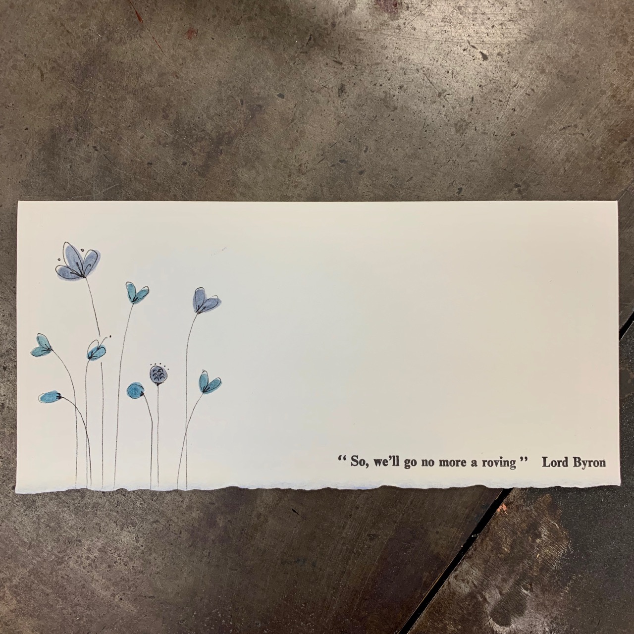
The person requested 50 cards along the lines of my grief cards that say "may flowers grow in the saddest parts of you".

So we determined a colour scheme (the blues), and a quote by Lord Byron for the front.  Inside was a personalised poem and his mother's name and dates of her birth and death.

So two print runs and hand illustration.

In the end, I think they turned out well.

Arches Velin is a lovely creamy paper which is soft in the hand.  The subdued blues of the flowers and the personal and meaningful quotes worked together well.


Such a poignant quote.


I was able to do a few different colour ways and individualise the flowers here and there.


And then 50 cards and 50 envelopes were packed and ready to head out across the world.

In between commissions and moving house, the studio hosted two groups.  Last week the Maleny Visitor Information Centre volunteers visited so that they could get a really good idea of who we were and what we did.  A fun time was had by all, and folk left having printed a wee thank you postcard.


Then on the weekend The PaperMakers and Artists of Queensland stopped by (they came from all over South East Queensland) and we had a good few hours trawling through my artists books, listening to my story about letterpress and printing and playing with the presses.  They got to print a postcard about their love of paper, and one about the title of a paper quilt project they are doing .  And of course because they
 are artists they experimented and tried this and that!


It is always a joy to spend time sharing my passion for letterpress and its history and of course, paper and artists' books, so I also say big thanks to the folk who visited!

Tuesday, August 11, 2020

What happened along the way to "on joy -"

 I really am pleased with how this book worked out as I was far from convinced that it would actually get somewhere.

To begin. 

I had thought that Barry and I could both do with a little nudge along creatively - trying to find ways to explore the letterpress beyond our initial thoughts and thinking.  We spoke about doing a kindred project, using the Artist Book Ideation cards I had purchased from Flying Fish Press many moons ago.

So at the end of June, we sat and selected our cards together, and these were the guides:

COLOUR: Black and White 

PAPER: Transparent and translucent 

TEXT: Collaborate with a poet/writer 

STRUCTURE: Unbound 

IMAGE: Found image 

TECHNIQUE: Mixed media 

LAYOUT: Based on a grid 

ADJECTIVES: Fragmented or mosaic Mysterious or coded Surreal Allegorical Graphic

I really like this process for busting out of my own thinking.  One of the great gifts of this project was it allowed, encouraged, forced, me to look at my translucent papers and work out how to use them.  I have had some of them for so many years, yet have never really put them to too much use and here was a real opportunity.

The collaboration around text was also a good thing to try to work on.  We both approached our friend Mary Jane Dodd to see if we could work with some of the words from her book "Offerings", and she generously and kindly said yes.

I selected only the opening few words from the full work "on joy -" but they resonate with the times.

The rest of the work is beautiful and can be read here...

So I wanted to work with loose unbound pages, in a grid, that when layered together could create a whole. I wanted to work with the notion of shattering into pieces and used a found image of broken glass. I wanted to use thread.

And so it came about that I traced the image onto a beautiful Japanese paper (sekishu kozogami mare) and then cut it into 16 pieces.  I had four pages of tengucho (18gsm), and placed 4 squares on each page. and then stitched the lightest tengucho paper (4gsm) over the top in a 4cm grid. The squares were held by the stitching together of the paper. Leaving those threads dangling as I do.

A reminder of just delicate that 4gsm tengucho paper really is...

See here and here for some earlier process posts.

I tested printing onto the 18gsm tengucho and it was divine.  And then I thought about the way I had proofed it to check alignment and realised that if I printed three times (without re-inking) and moved the paper a tiny bit each time I would get the echoes of the words. I love those unexpected moments that truly make magic of a piece.


And then it was done.


And it feels special.

Tuesday, July 28, 2020

OPEN finally, and beauty

Over the weekend the ink dried on the covers for my poem Open and I was able to work out the edition as well as put the Press' chop on both the poem and the cover.  Nice finishing off work.

Here is the finished product, photographed in dappled light in the studio.

Dappled - such a lovely word...

The covers of the first five.


The cover of Number 1.


Cover opened.


Poem turned, inside back cover.


The bits together.


I ended up with an Edition of 20 - which I find rather remarkable.

For the trials and tribulations of this piece see here; and for the options I played with for the cover, see here.

And as I went to exercises early yesterday morning - sombre beauty dawning.