Sunday, July 30, 2017

Epic fails...

You can't take on a project as big as this one is for me, without the odd mistake, error or utter fail appearing.

Last week saw a flurry of them really, and you just have to stay calm, breathe deeply, attempt to problem solve and hope that it all works out in the end.

The first one happened as Barry and I were printing the third letterpress print for the series.

Despite all my best efforts to keep the furniture in chase in position; it must have moved a bit. I think it happened in the proofing as I had to change a few pieces of type over, unlock it and then re-tighten and I inadvertently unlocked one side that I had avoided unlocking before.  In the re-tightening, there were only millimetres in it; but that's all you need.


Some of the guilty type that started it all. Nobody's fault really - the type was damaged and  it only becomes clear once you proof.


That one resolved, I thought I would just go print a page for the book. On the Adana tabletop press which is my best mate, and has never failed me nor not played nicely with me. Until it didn't.

How's this for a bunch of failed prints? On and on and on it went.


We got up early the next morning and Barry came over to help see if we could sort it out together. A bit of engineering and we think we've got it - the good news is the book page printed well.


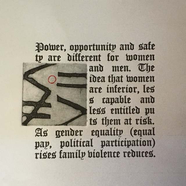
And then the final of the letterpress prints. This one shows us moving the paper up and down to try to get it to fit around the etching.  Each and every one of these prints caused us grief.


Bad huh?


We finally worked out why it was so hard. The line above the etching had a descender (the y). The line below the etching was full of ascenders (the k, the i, the ls). With the top descending and the bottom ascending - we were squished in the middle! This hadn't happened on any of the other etchings, and in future I will choose my words more wisely.


Here's the print run.  Two epic fails on the the top step, an edition of 5 (just!). 3 possible A/Ps and two other fails, less epic. And then some blanks and some fun.


Onwards!

Thursday, July 27, 2017

Thursday Thoughts...

“Art is giving yourself permission to translate life. Exactly the way you feel. See. And hear it. Be the artist you are. Give yourself permission to speak your own language.”  

Nayyirah Waheed

I am pretty sure that most artists would agree with these sentiments. That urge to translate what you see, read, hear or feel into something. That need to create something in response to beauty, to horror, to politics, to love...

And in doing so, translating it into your own unique language - expressing it in a way others don't, and sometimes in the only way you can.

Perhaps writers feel the same way; when they write they are translating life as well.

That may set us apart from those who absorb and reflect but aren't urged to respond in some way? Activists would say they respond I am sure so I guess it is tricky to try and imagine how it is for others.

All I really know is that I think making and creating is about translating life, and speaking in your own language. Permission granted.


A wee wintery embossing of mine...

Tuesday, July 25, 2017

The bits and pieces of studio days

Having broken my multiple projects down into further multiple tasks, I find myself doing bits of this and that most days I make it the studio.

But still, I am making progress.

In between times I did some book marks for guests at the Celebration of Books.


 A few practises here and there and oh, that red dot must have been practiced here as well!


And then because you can, more bookmarks just in case.


Practising calligraphic layouts to accompany the etchings on the wall. I am trying to have siblings in a way - letterpress words and calligraphic words.  I have clearly changed from my early play with balsa and upright to return to my heartbeat script. 

I like it when it is dense and it offers that tricky reading experience I am trying for with both the letterpress and calligraphy.

It felt to me as if reading about these issues shouldn't be easy and flowing; the reading should jar and jolt and be hard to read somehow. And so I try to make that a part of the experience of engaging with the work.


 Getting there...


And then to practising some stamped words that will appear in the books, alongside the titles of each piece that hangs on the wall. Again, aiming for siblings - the books and the wall works will be related but the books are not a direct replica of what is on the wall.

Forever testing, measuring, comparing...


Using up some ink after letterpress printing, making small thank you cards.


And loving those moments when you go what if I just turn the paper around a few times?


 And feeling truly thankful as I wander back from the studio to the house - and smile at these wee folk.

Sunday, July 23, 2017

Pedantry

There is nothing groundbreaking in this post - just a detailed examination of the elements I try to get right and the steps I take to get them there. Equally well titled - how very slowly things happen.

In preparation for the Sydney Paper Contemporary, we are pulling together an advertisement which means we need photos of finished works.  Kind of sort of finished in my case.

So I printed a photo of one of my most recent prints because I liked how it had turned out, and then spent ages trying to work out where to place the third element - the red circle I posted about way back here.

The story is one of gender equality and how inequality promotes violence against women. The imagery is trying to talk about quality, inequality, being less than or more than.  I chose the red circle as it forms part of the gender symbols we are familiar with - the circle with an upward arrow for male; and a circle with a downward cross for the female.  I wanted gender neutrality so chose just the circle.

But where to put it to help tell that story, yet remain part of an elegant, well-resolved design?

All I knew was that I wanted it to relate to the equal sign.

So this is what I did...


You can see there were 9 variations I attempted. I came down on the side of this one.


But laugh out loud, the printed photo was not the exact same size as the print, so when I popped the mark on, it didn't land just where I thought it might; but it was good enough to photograph and send off.

So many things to focus on and learn.

Thursday, July 20, 2017

Thursday Thoughts...

"Poetry is when an emotion has found its thought and the thought has found words". 

 Robert Frost

Today's thoughts are about books and I think that poetry can connect to books quite well - plus I am still enjoying the experience of Poetry on the Precinct and poetry is filling me up a little bit these days.

I think that this description of poetry, the idea of emotions linking to thoughts and to words, captures the essence of poetry so well. Poetry can evoke emotion, yet it is a thoughtful and considered process; where every word has a purpose, every position is delicately calibrated, the rhythms and the placement are everything.

I think poetry is perfect for dipping into and for reading something that speaks precisely to you, at that time and in that place.

My emotions found their home in some words, and then my thoughts found some words...


Tuesday, July 18, 2017

Poetry on the Precinct

I was way too tired to blog on Sunday - we had just had the most successful and fabulous Celebration of Books weekend and I fell in  a heap.

In fact I think I was so busy I barely got a moment to take a photograph so I am relying on others to show you a few bits of the day. Barry took all of these photos I think...

The main event I was responsible for was Poetry on the Precinct.  We chose a gorgeous spot, under a huge old tree that looked out over the community precinct land.

The sun shone, the wind blew but we had a great time.

We were welcomed by the group Joy of Singing Maleny who sang about community and welcome.

The work of six local poets was read by 4 local poets.

Each was different and each was perfect. It was an amazing collection of superb poetry and we were all so lucky to listen.  The wind made it hard for some of the voices to carry; but we learnt a lot and there will be changes if we do it again next year.


Angela Gardner of lighttrappress opened,


and was followed by Robyn Nugent who read her own work, and the work of her daughter Sophie.


I MC'd my way along with the wind in my hair...


Elsie Brimblecombe is a local artist and poet.


Vivi Mohan is an up and coming local poet, who read her own work and that of her mother MTC Cronin - an internationally renowned poet - who was ill on the day.


The final panorama shot - such a gorgeous day filled with beautiful words. I think I said at the end that poetry is the perfect form. No matter where you are in your life or what you are experiencing, poetry has a way of being able to describe it, help you with it, and offer solace or celebration.


Thursday, July 13, 2017

Thursday Thoughts...

“May I recommend serenity to you? A life that is burdened with expectations is a heavy life. Its fruit is sorrow and disappointment. Learn to be one with the joy of the moment.” 

 Douglas Adams, The Long Dark Tea-Time of the Soul

I loved this opening sentence - of course you may! It sounds delightful!

I think even the word serenity sounds serene and capable of producing the essence of the word.

At first I wasn't sure if serenity was always linked to the notion of being one with the joy of the moment; but as I thought some more about it; it seemed to me that serenity really is just all about being at peace in that one moment; of being still and calm and tranquil and happy right then.

As I read and write this, it feels like a quest I should embark upon - to feel that oneness with the joy of the moment. Joy is a word we don't use all that much, yet it is perfect in its simplicity and you know when you feel it!


Recent beachside serenity...

Tuesday, July 11, 2017

Onwards!

There's  a song line "the beat goes on..." and for sure in the studio here  it's "the printing goes on...".

I have broken up the mammoth task of printing all of these prints and making a couple of books into small, manageable steps, and I seem to be making progress.

I rarely get a full day in the studio where I can go straight through and achieve great things; my time is usually more fragmented than that, and I need to have achievable goals.  Plus with printmaking and printing - the ink has to dry...

I managed to do the letterpress around the etching on Sunday which is great - so that is now two prints ready to stack and store until I add the red highlights.

This is the print the asks the question "what does gender equality have to do with it?".


There are the 12 prints, from which I can select  five for the edition. Plus a few spare text pieces, where I made add a different element in at some point.


The etching that talks about equality and inequality - and where I need to practice the location of the red circle!


I have printed the etching for three of the prints that will go together for the book. Hopefully I will get time in the next day or so to have the fourth etching printed for the book.  The books will also have calligraphy in them and a letterpress title page, and possibly a colophon if I can manage it.  Time will tell.


I have managed to do the etchings for a couple of the calligraphic pages as well - so two down and two two go.  At times it feels like a massive project management job - keeping track of where I am up to and where I need to be by certain times; and hoping that I am maximising my time in the studio and the ink on my presses.

Each and every experience like this just teaches you so much - solidifies your understanding of techniques and ways in which you do things.  I would love to be able to sit back and observe as a third party sometimes.


And at the end of the day - sunset.

Sunday, July 9, 2017

Type change over and printing

I am preparing four prints for the Sydney Contemporary - each requiring an etching and some letterpress type.  To help make them all look and feel as if they are related, I am placing the etchings into the same place amongst the type each time, keeping the same shape.

Each print has a different etched image, and uses a diffenret typeface, so I am printing the etchings first, and then setting up the type in the  letterpress.

Having completed the first print, it was time to change the type in preparation for the second. Because I really want to keep it simple and try to make it easier for me to register the two prints (avoiding overlaps or gaps or skew-iffedenss) I left the chase pretty much locked up and tried to simply replace the type line by line.

It was slow and steady, but little by little I got there.


I quite enjoyed the changeover process.


And today I printed the type around the etching.

As ever, when I finished (it was only a run of 15) there was still plenty of ink on the plate and rather than waste it, I decided to test the letterpress on a range of papers.


I tired tracing paper, goyu paper, brown or kraft paper, and really lightweight Japanese tissue; as well as onto some scraps of braille paper and others where I had cleaned my rollers off a while ago.


Fascinating results, and definitely positive reinforcement about keeping those bits of paper where I clean my rollers and do other crazy tests; the letterpress can look great on them.