There is nothing groundbreaking in this post - just a detailed examination of the elements I try to get right and the steps I take to get them there. Equally well titled - how very slowly things happen.
In preparation for the Sydney Paper Contemporary, we are pulling together an advertisement which means we need photos of finished works. Kind of sort of finished in my case.
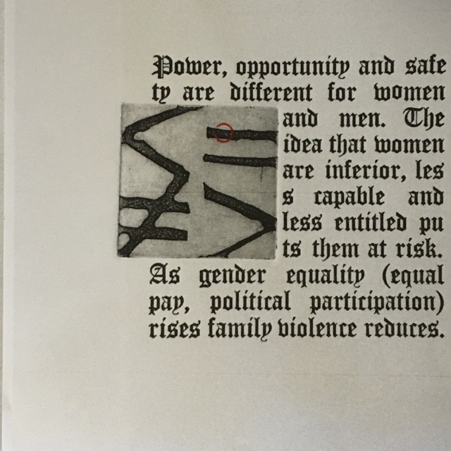
So I printed a photo of one of my most recent prints because I liked how it had turned out, and then spent ages trying to work out where to place the third element - the red circle I posted about way back here.
The story is one of gender equality and how inequality promotes violence against women. The imagery is trying to talk about quality, inequality, being less than or more than. I chose the red circle as it forms part of the gender symbols we are familiar with - the circle with an upward arrow for male; and a circle with a downward cross for the female. I wanted gender neutrality so chose just the circle.
But where to put it to help tell that story, yet remain part of an elegant, well-resolved design?
All I knew was that I wanted it to relate to the equal sign.
So this is what I did...
You can see there were 9 variations I attempted. I came down on the side of this one.
But laugh out loud, the printed photo was not the exact same size as the print, so when I popped the mark on, it didn't land just where I thought it might; but it was good enough to photograph and send off.
So many things to focus on and learn.


I love the power in this piece, your color choice and graphics.. Stunning
ReplyDeleteThanks so much Cat - the work is coming together I think, and hopefully will speak...
DeleteI like that placement ... likewise the less than, equal, greater than, and not equal signs. Such a thought-provoking graphic!
ReplyDeleteThanks Liz - I think this is my favourite of the four graphics too. So funny how the placement of one mark can absorb one for ages; but does make a difference. Go well.
Delete