As previously seen, I still like to do a good old cut and paste and print it out to see where I am headed with long and large amounts of text for walls.
I have the honour of attaching the storyboard to the artwork that sits above the checkouts at our local IGA store. Back in 2014 Noela Mills designed the work, Edith Ann and her team installed it and here in 2016, I am completing it with words. Rob and Sam the IGA owners, say that folk really love looking at it, but they don't always fully understand it, so could I please help tell the story?
Happy to!
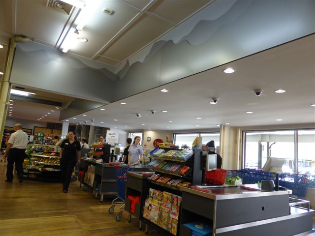
The two walls I have to place it on are 8m and 8.8m wide, so I want the words centred on both.
Rather than try to get handwritten calligraphy to scale I chose a computer font that looks slightly handwritten and scaled it up.
So I thought about what size I thought would work and decided the only way I could comfortably do it was to print it out.
The good news was that I printed on old letterhead, and that the paper was then shredded for mulching the garden...I used 48 A4 pages up front.
As you can see my first attempt at printing went a long, long, way, snaking through the house for 9.5m...a bit too long.


So I fiddled and faddled with font sizes and scaling and worked it out pretty well after quite a few extra efforts.
The top run is at 300pt, the second at 250pt, the third at 220pt and the fourth at 235pt.
235pt won.


So now to choose the colour; to measure the height above the baseline (currently the baseline is hidden by Christmas decorations) and then organise to get it printed, cut and installed.


2017 here we come!
I have the honour of attaching the storyboard to the artwork that sits above the checkouts at our local IGA store. Back in 2014 Noela Mills designed the work, Edith Ann and her team installed it and here in 2016, I am completing it with words. Rob and Sam the IGA owners, say that folk really love looking at it, but they don't always fully understand it, so could I please help tell the story?
Happy to!

The two walls I have to place it on are 8m and 8.8m wide, so I want the words centred on both.
Rather than try to get handwritten calligraphy to scale I chose a computer font that looks slightly handwritten and scaled it up.
So I thought about what size I thought would work and decided the only way I could comfortably do it was to print it out.
The good news was that I printed on old letterhead, and that the paper was then shredded for mulching the garden...I used 48 A4 pages up front.
As you can see my first attempt at printing went a long, long, way, snaking through the house for 9.5m...a bit too long.


So I fiddled and faddled with font sizes and scaling and worked it out pretty well after quite a few extra efforts.
The top run is at 300pt, the second at 250pt, the third at 220pt and the fourth at 235pt.
235pt won.


So now to choose the colour; to measure the height above the baseline (currently the baseline is hidden by Christmas decorations) and then organise to get it printed, cut and installed.


2017 here we come!


