Like most of Australia we are sweltering and going thru what can only be called a heatwave. A very long, dry, hot stretch where the only answer in the afternoons is to stay inside and read.
I had thought about heading to the studio in the shed, but it was too hot - and we had loaned our portable air conditioner to our elderly neighbours as the heat has been really debilitating. Instead I got to fiddle and prepare some of the materials for a course I am working on called "Black Beauty".
It will be all about exploring the beauty of black backgrounds; and how colours can jump and leap out against them.
My starting point was to just prepare samples. I have used Arches Velin Black here as the base and just gone thru my pencils, paints, inks and watercolours to see what happens. Lots of lovely moments!

It intrigues me how well watercolours can show up against black...

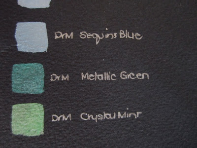
I expected the metallic inks would shine and they did in lots of glorious colour.
The gouache also did well - lots of pigment strength I think.

Watercolour pencil also got a go - as pencils and also watered down..

As did plain old Coloured pencils - I do love them so.

And even the cheap pencils I have for when kids are around did a fine job...

It feels good to have such a set of swatches at my fingertips. I often wish I had something like this at hand; but can rarely be bothered to invest the time it takes to prepare them. I'm glad I did tho!

I had thought about heading to the studio in the shed, but it was too hot - and we had loaned our portable air conditioner to our elderly neighbours as the heat has been really debilitating. Instead I got to fiddle and prepare some of the materials for a course I am working on called "Black Beauty".
It will be all about exploring the beauty of black backgrounds; and how colours can jump and leap out against them.
My starting point was to just prepare samples. I have used Arches Velin Black here as the base and just gone thru my pencils, paints, inks and watercolours to see what happens. Lots of lovely moments!

It intrigues me how well watercolours can show up against black...

I expected the metallic inks would shine and they did in lots of glorious colour.

The gouache also did well - lots of pigment strength I think.

Watercolour pencil also got a go - as pencils and also watered down..

As did plain old Coloured pencils - I do love them so.

And even the cheap pencils I have for when kids are around did a fine job...

It feels good to have such a set of swatches at my fingertips. I often wish I had something like this at hand; but can rarely be bothered to invest the time it takes to prepare them. I'm glad I did tho!

The colours look so dramatic on the black - I'm surprised how well they stand out. You'll have these treasures for years.
ReplyDeleteThanks Carol - it's one of life's lovely surprises isn't it how stunning the colours are on black? I love them and hope this set of swatches will keep me in good stead for a while yet. Almost tempts me to make a few more...
DeleteWell done F, great project for a hot day - not too much brain drain, but feeling like you have acieved something.
ReplyDeleteSo true N - way too hot to be creative or productive (altho we did get some tidying/filing done as well). Just the right sort of no-real-brain activity I could handle in the heat!
Deletethese are gorgeous Fiona, how the black background affects the colours is really interesting. I often think swatches like these are beautiful works in their own right...I recently made batch of dyed paper swatches and love to just leave them hanging up!
ReplyDeleteThanks Suzie - so true re the beauty in the simplicity of the mundane here. I think they are gorgeous and could just keep looking at them! So glad you are enjoying your dyed paper swatches in the same way...
DeleteI'm surprised you could get anything done in the heat! its cooler here today - with drizzle and even (ooo good golly) a touch of rain.... fingers crossed it hangs about for a bit - and I'll happily then share it with you....
ReplyDeleteBeyond belief hot here Ronnie - we all nearly expired yesterday and our poor neighbours...still it's great to know you are cool and a wee bit rainy, we'll take whenever yo can spare it! Weirdly we were dealing with floods and soaking this time a year ago. Hope the rain hangs with you for a bit.
DeleteCool! I love this kind of laying out of colours and writing / text - like the selvedge of printed cloth, or the list of coloured threads to be used in a needlepoint. There is something so scummily attractive about it I find.
ReplyDeleteI did something similar in a sketchbook in a hotel in the USA just after I had indulged myself with a complete set of Prismacolor coloured pencils (so much cheaper in $$ than in ££) testing them for their mixing possibilities. I went on to use some of the resulting 'charts' in a couple of work pieces.
Looking at so much black may have made you feel cooler. I did some experiments when I was working in a publishing house in Zimbabwe way back when, into reactions of readers to different shades of white/cream/grey in the bright hot light and indoors on hot days - and the whiter was definitely much more uncomfortable to read for any length of time.
Thanks Olga - a bit of an experiment, but fun to see the differences. I'm intrigued by the possibility of black leading to cool...fascinating!
DeleteI'd say that's a productive day's work! The rainbow colors look gorgeous against the blackness, and the effect of the samples all together is very appealing.
ReplyDeleteIt's interesting how the weather can be a determining factor in what kind of work is feasible on a given day...I'm impressed by how much you actually managed to get done in spite of the heat. (In Florence it's so cold at the moment that my fingers feel rather slow & clumsy at the studio table!)
Here's hoping for more moderate temps, there & here...
Hi Lisa - the final gathering is a little bit like a gorgeous art piece of its own isn't it? Sometimes they are just so beautiful in their own weird way. It is so hard to imagine the freezingness and cold when we are literally boiling; but the world will turn and we'll be cool enough soon enough. It was interesting that I had no energy for creative - just for practical.
DeleteA time-consuming, but worthwhile, exercise Fiona. Well done.
ReplyDeleteSo funny Jo - I recognise the worthiness of it as soon as I do it - I just fail to get any enthusiasm up to to do it for other things! Perhaps now I will...
DeleteUseful and beautiful! I'm impressed at the vibrancy of all these colours against the black. Like Ronnie, we are having a little rain and cooler days, so very welcome. I hope the rain moves on up to you.
ReplyDeleteTHe perfect example of form AND function perhaps Carol? Like you the vibrancy of the colours really appeals to me. We too have just had the most beautiful day of rain - so so refreshing. Hot days ahead but we have had some respite.
Deletei think this is a super sample set to have, your students will love them (as do you) AND it paves the way for you thinking about other sample sets. one of my teachers had a set of glues on board...how different object stuck (or not) with certain glues. very helpful, and the samples look so nice all tidy!
ReplyDeleteThanks V - I love the idea of a glue sample set! It can be so helpful to see the differences can't it and then to establish your own way of recording how things work and what they do.
DeleteWhat a great thing to do for your students!! I'll be doing some samples soon for my classes that start tomorrow, but nothing quite as organized and elegant!! I'm working on black paper these days with white acrylic ink. I'm searching for the paper that will take the beating I need it to. I'm looking into Arches Cover, as I think it might do the trick. I sooo love Arches paper. Happy sampling.
ReplyDeleteIt's funny how little squares of colour can look so organised and elegant - but I do agree! I've been watching your white on black with interest - it is producing some amazing results. This Arches is pretty tough. We call it Velin, you call it Cover I think...
DeleteYour soaring temperatures have made the national news here Fiona and stories of fires and the extreme heat seem incongruous as we battle the snow and freezing cold. All in all I think I'd rather have it too cold than too hot and imagine that black paper absorbing the heat as you worked on it. I am truly surprised at the depth of colour you've achieved, particularly with the differing varieties of crayons, but think the idea of a workshop dedicated to working on a black background sounds exciting. Makes me think about designs for stained glass and all that blackleading..... I wonder if the warmth made the crayons softer and willing to give up their pigment more? I might have a try and see if sub zero temperatures have the same effect!
ReplyDeleteWe have certainly seen some extraordinary days this summer Lesley - I can't believe how some folk are coping when it never drops below 38C (100F) at night. Way too much for me. The colour on black is very reminiscent of the stained glass kind of thing isn't it? My head goes there straight away too. you might be right about the pigment release in the heat - I might repeat it in July!
DeleteWow. Diligent. And hugely useful I imagine. Well done. Envy creeping into that comment .......... x
ReplyDeleteHi Susan - I felt very happy and just a little bit satisfied at the end! I rarely do this sort of practical, up-front work so was impressed by by own efforts. Laugh.
ReplyDeleteThe problem with black is that it's so hard to photograph in all its depth and subtlety! I've used a lot of black fabrics lately, and of course they are so much "better" in real life. I'd love to see your swatches "for real" ... might have to make my own! Thanks for the inspiration.
ReplyDelete