I have been working steadily on these books - perhaps intermittently - but definitely intermittently steadily!
I have a variable edition of 5. They are different sizes and different papers; yet have the same words and images.
Initially the plan was to do 5 x book cloth, hard covers; but I have begun planning some variations on the covers as well. I wonder if its because I get bored easily?
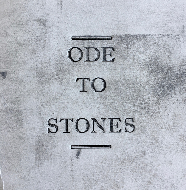
Nonetheless I am in love with the title typeface and think it offers the gravitas of stones that I was hoping to portray.
It so funny the many little decisions you make along the way - like using a serif typeface because it feels stronger than a sans-serif one.
Five title pages...


A colophon. That beautiful typeface is Caslon Old Face Open Bold!

A few peeks inside - the words and the stones...


It is edging closer.
And in preparation for the weekend - bookmarks for participants!


I have a variable edition of 5. They are different sizes and different papers; yet have the same words and images.
Initially the plan was to do 5 x book cloth, hard covers; but I have begun planning some variations on the covers as well. I wonder if its because I get bored easily?
Nonetheless I am in love with the title typeface and think it offers the gravitas of stones that I was hoping to portray.
It so funny the many little decisions you make along the way - like using a serif typeface because it feels stronger than a sans-serif one.
Five title pages...


A colophon. That beautiful typeface is Caslon Old Face Open Bold!

A few peeks inside - the words and the stones...


It is edging closer.
And in preparation for the weekend - bookmarks for participants!


The stone books are absolutely gorgeous. I've enjoyed to see glimpses of them here and there. Eli
ReplyDeleteThanks Eli - when I have finished the covers, I will take you for a proper walk through I promise! Go well.
DeleteYour calligraphy takes the eye on a wonderful wander ...
ReplyDeleteGlad you enjoyed Liz!
Deleteloving all these variations for your Ode To Stones
ReplyDeleteThis has been a real learning piece for me Mo - so many things to try and sort out I think it has taken me 5 books to work out what I should be doing!
Delete