Thursday, February 6, 2020

Thursday Thoughts...

"Every artist should have a cheap line. It keeps art ordinary" 

John Baldessari

I read this one a long time ago and is sat deeply in mind - occasionally I would lift it up again and look at it, consider it, and ponder how to apply it to my work.

I actually think is an interesting notion because for somebody like me, whose work has a very very niche market, it could make my work far more accessible.

Accessible I guess in terms of depth, and in terms of availability.  I continue to ponder!

However it's the second sentence that makes me think more about it - that it keeps art ordinary.  I like the idea that art could/should be a regular part of life; that it should appear in people's lives as readily and easily as furniture.  That folk should be able to wander their garden and see beautiful pieces of art that make them smile; that art should be present in streets and shopping centres; that art should be within their homes and houses and seen each morning.  Nothings says ordinarily like art in a bathroom or toilet.

But in referencing back to the first sentence; I think it means that art should arrive in the mail - an art card or illustration on an envelope; that art should be able to be purchased and worn; or carried on a bag; or used to tie your hair up...

And maybe by doing so, you aren't cheapening your own art, just making it available for more folk to enjoy.


Available here.

Tuesday, February 4, 2020

Hagstones and others...

Life has been quiet in the studio.  We have had some blazing days and yet today we remain shrouded in mist with rain dripping from the sky.  It's a nice change, the soft grey colours are quiet and gentle, and a couple of times today we have remarked it feels like Scotland.

Recently I read an article called In the Eye of the Hagstone. It is from a  journal called Elementum which I get delivered to the cottage - beautiful writing about nature with gorgeous illustrations. The article is not about our neck of the woods, but it does describe hagstones which I only learned about on our last visit.

There seems to be one beach near us - Sandside at Reay - on which it is possible to find hagstones.

Ragstones are stones that have a hole run right through hem, and they have all sorts of histories and myths around them.

Barry and I often wander beaches looking for beautiful stones, and I was amazed when he found a stone with a hole right thru it!  Some link to hagstones appeared in one of my feeds and I was hooked.  And of course, went back to the beach to look for more but came away empty handed.

My Dad arrived for a visit and on one of our forays we stopped at Sandside again and went looking once more.  I was absolutely chuffed when he found one as well!! Amazing.  And then just as we left, I found one too, so that made three and we each had one.

It felt very special and the three stones stay at the cottage.


Amazing.


At the cottage I also collect door stones - a wee gathering of stones to welcome your at our door.  On one side I have the heart stones,


and on the other side I have the 'the world is a circle" stones.


I love the circles on these stones and how they remind me of being linked and connected, no matter where I am.


And one of my favourite beaches in the Highlands - Ardmair just north of Ullapool.  Such beautiful, beautiful stones.


It's a grey day here and it feels like home.


Sunday, February 2, 2020

Dewey Dewey Dewey

We have had a pretty darn busy week this week, but I got a lovely surprise in the post when I received this great book on the Abridged Dewey Classification system from Liz Ackert in Texas.  Liz is a former librarian who put me on to thinking about using numbers as codes of classification and I am thrilled to have this book in the studio.  I have dug, and delved, and dipped into it, and fallen down many a rabbit hole as I investigate what numbers can mean; and I have been thinking about what they can become.


As a small gesture of beginning, I have printed some of my card sets and wrapped them in fine Habu threads.


The first five I selected are these.


My investigations made me think about how to ascribe peace within the Dewy system, and this is as close as I got - conflict resolution.  Part of me was a tad interested that peace in and of itself didn't seem to have its own classification...bu I will keep looking.


Of course, feminism gets a card; and I am pretty confident that this is its number.


I went looking for support for LGBTIQ rights, and landed here.


I came up with this as my representation of family violence/domestic abuse and I think its pretty close.


And here is where my support for asylum seekers and refugees was found.


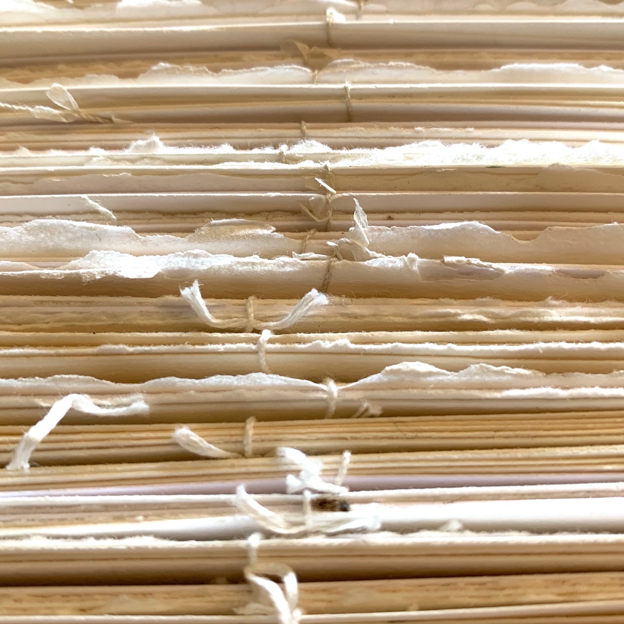
As ever, I adore the edges with their deckles and threads.


 It is a small start but I think I can include these Dewey numbers in different parts of my work and am sure I will spend a lot of time digging into my new book!

Part of the reason we have been busy is that as part of our annual cull and clean up around the block; we held a garage sale on Saturday.  We had chosen to send all our proceeds to bush fire relief in Cobargo and were thrilled when we cracked the $1000 mark. We will be seeing our donation through to Cobargo Community Bushfire Recovery Fund, with thanks to Ronnie Ayliffe who has worked tirelessly to let the world know of the devastation so many have experienced and continue to face as the fires still burn.


If you are interested in funding direct to the community as they work to recover over the next weeks, months and years, here is a link to their GoFundMe page where you can also find their bank account details for direct bank transfers.


Thursday, January 30, 2020

Thursday Thoughts...

“Until I feared I would lose it, I never loved to read. One does not love breathing”. 

Harper Lee

I imagine Harper Lee was thinking about a time perhaps when her eyes would give way and she might not be able to read.

Given that today we have other options for reading (in particular audio books) the practicalities of the quote seem less pertinent; yet the thrust of it still feels quite relevant.  It seems to me to speak more about things that we take for granted.

I really do love being able to read.  I love knowing that I can always pick up a book and lose myself in it.  That I can turn to a book for solace or comfort or learning.  That reading can transport me and calm me and excite me.

Perhaps she had taken the ability to read for granted; in much the same way most of us take the ability to breathe for granted. We don't think about it, we do it automatically, sub-consciously and regularly.  And perhaps the point to be made is that occasionally it is good to pause and notice. To pay attention to the the multiplicity of things we take for granted, and then be grateful for them.

And love them just a bit.


Tuesday, January 28, 2020

Fiddling with the letters

I was merrily working my way along with the embossed lino cut and managed to create a nice frame for the letterpress type. All good.

Then I had to work out how to get my type to fit, and so another rather long process got underway.

I knew the quote I wanted to use and the size of the frame; I just needed to work out if I had the right amount and right size of type to do it. I also wanted to fully justify it - to help retain that solid sense of the frame.

So I began with the type on the left. But it was too square and didn't quite fit. So I went and tried the bold version, which became a bit too heavy and strong (even though it took up more space). Feeling a bit like Goldilocks I was.


The other challenge was did we have enough pieces of type to do the quote? So I had to do the maths on how many of each letter I would need.


The bold type really did look too heavy and squat against the lovely long thin lines of the tree trunks.


Here are a few of the options I tried.  Also getting the attribution for Mabel Thynne in properly was proving a bit of a challenge.  Again very Goldilocks-like: too high, too low, too big...


I landed on this layout, but couldn't work out how to sort out the big gaping holes. A note to self here - maybe hand emboss after printing?


I went to proof the text on the Adana and for whatever reason, it just wasn't working. I turned the chase around and tried to proof sideways - and damaged my type.  I had forgotten to check if the paper arm holders would hit the type and I got my answer for sure. They most definitely did.

Lead type is quite soft it seems.


The top line was most affected - the s, the e and the o.
This was a bit of a worry as I only had one more s and one more e in the case!
For some unknown reason an r disappeared from 'are' as well, and that used up the last r in the case! A close call.


 I wondered where Mabel's name should sit and it clearly was a bit wobbly when I sat it up higher.


It also didn't finish the frame edge off firmly up there, so I decided to drop it down and use lead not spacers to keep it firm


I inked up a dark green and it looked pretty good,  But those gaps were still a worry.


I had originally thought I would need to print the words first, then wait for them to dry, then put the print through to emboss it and therefore lining up would be tricky and hence the thought re hand embossing afterwards.

As I proofed the type on a proof emboss I realised I could emboss first, then print the type because the type print process wouldn't flatten the emboss. Technical issue which no one else would care about but it did make me very happy.

So I cut the lino again with fingers crossed that this was where the tree trunks would run; and went ahead and embossed first. I was working towards an edition of 5.


And I got them!


It is really hard to get the deep green colour of the ink in the photos, but there's a hint of it here.


I was pretty happy in the end; after all the thinking and problem solving. The print looks like it is mine; the quiet emboss and the words are all there is.

Sunday, January 26, 2020

Of lino and letters

I am participating in a group exhibition for International Women's Day. It is called "Eco-Women" and will celebrate women environmentalists, scientists, activists, artists and all manner of women who have helped build knowledge of our ecology and environment and who have also fought to protect it.

So I have been researching a few ideas and have happily landed on my woman.

I am getting my act together and am looking to combine letterpress and embossing.  Lino cutting is always a blast from the past for me so I have to reacquaint myself with what to do and how to do it; but I have spent many happy hour engrossed in the design, the tools and the lino - just quietly working away.

I am working with a local rainforest reserve - Mary Cairncross.  It is just down the road from us and a special remnant rainforest. So I sketched out some ideas of a path within the rainforest.


And then decided to add the block of text into the middle. I transferred the imagery to the block, and began to carve.


Once I finished carving I did a proof on cheap paper to see what I thought. Apart from the crinkles, possibilities were emerging.


 Doing a proof on real paper is always so much more rewarding.  The carving is coming up well, but I am not so sure of the design. The pathway and rocks are too weak at the bottom and the text block means you kind of lose the notion of the pathway anyway...


But delicious.  So I am now carving a new block; I have tightened up the frame a fair bit so the text block will be more defined. Fun times!

In other news, I took receipt of an unexpected parcel during the week.  I knew who it was from (dear friends) but had no idea what they may have sent. It was pretty heavy and a bit bulky.

The grin was as wide as the grand canyon when I opened it - chock full of italic wood type!


It was dusty and dirty but beautiful.  I don't have any Italic wood type and it is about 5cm high and bit of a fun typeface.

So I washed it all in warm soapy water and scrubbed it with a brush - now it is shiny clean. I had fun circling it around the sink and kitchen bench in the studio


And there was also some bonus type in it - a different typeface but same size and italic as well, so it can be a capital letter or I could figure out a bunch of words that could be printed with what I have!


 I think I have the best friends...

Thursday, January 23, 2020

Thursday Thoughts...

"Speak your mind, but be kind."

Truism, author unknown.

Today's Thursday Thoughts turn to the topic of 'life'.  I am not sure why this one grabbed me today, but it did.  It is on a yellow sticky note attached to my computer and I glance at it each and every day, reminding myself to be assertive yet kind.

I think many of us are hardwired or trained to restrain ourselves from saying what we think - whether as women we are socialised to be peacemakers and to not rock the boat; or generally speaking we may be shy or unsure of ourselves in certain situations.  Or perhaps we don't have much experience in voicing opinions and being heard.

Despite my feminist strength of character, I am oftentimes left not knowing how to say what I need to say.  Sadly when it does come out, it can sometimes sound a bit shouty, angry, het up, furious or some other form of less than pleasant rage.

And so I remind myself that I can say what I need to say, but I can also be aware of the other person or people.  I can speak my mind AND be kind.

Somehow these simple words give me permission to say what I need to say, in a manner in which I would like to hear it if it was said to me.

Weird how the simple ones can end up dealing with great complexity!


A photo my dad sent me from Scotland when our daffodils were blooming there...it speaks of kindness to me...

Tuesday, January 21, 2020

Of stitching britches, and babies

My favourite jeans for yard work started ripping.  I figured I could keep wearing them and continue the ripping or I could throw them away, or I could mend them; also with an SOS out to Liz Ackert having seen her darn hers beautifully, I undertook to have a crack myself.  

It makes me laugh to see that the main rip has yet to be attended to; however, many small frays are being dealt with.


I decided I would try and test a few different ways to see what aor tof stitching enjoyed and what works for didn't work.

These two frays show random horizontal and vertical stitching and seed stitch.

Each darn has a patch underneath it as well.


This has proven to bey favourite  so far, so I am going to use it on the rip if I can.


And so it begins...


All poor efforts are mine and purely mine and have nothing to do with Liz's suggestions!

And so to babies...

My cousin's daughter had a baby on new year's day and I am doing a calligraphic Y for them.

I wanted to be a bit playful with this one, so started to draw and doodle a bit.


And then tried to transfer onto proper paper - with mixed results!


Finally got one that copied well.


I trialled a few colours - I first thought of the amber colour tones as I had seen the wee one in clothes like that a fair bit.  But then I fell for the brighter blues and greens.


So I finalised a blue-green one.  Then I saw more photos of the bairn in amber/gold/ green tones so went away and did a final of that and forgot to photograph it before taking it to the framers! Laugh.


But you get the idea...