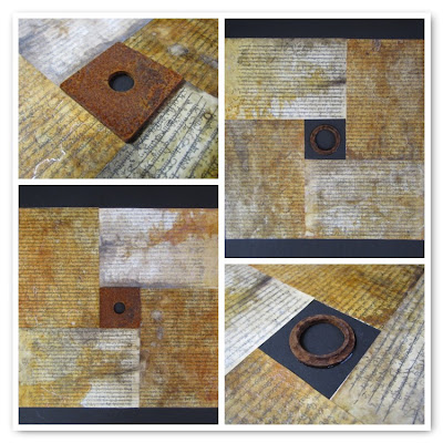
I have been wondering about how to make mosaic-tile type photographs as I have seen so many bloggers using them to such a good effect. Some kind folk offered to helped me out with photoshop templates and so on, but I tried and failed and felt a bit inept (thanks for trying Liz!).
So I took some late night moments this week to see if I could discover an easier way of doing them and this is what I found...
My first trial was a mosaic of a few of the finished 'black and white and a touch of ...' alphabets over at alaw2011. I already put all the finished alphabets into a slideshow on the blog, but I thought it might also be nice to have a 'group photo' as some point and post it as a blog post. I used a 2 x 2 grid here so didn't collect all of the finished ones yet (it was a trial after all). Having kind of sort of mastered the process, I will definitely go back and do a couple of group photos for that blog.
Liz had already used a grid in her final shot and it added an interesting design element to the layout. From L to R, top to bottom: Heather Courtis, Liz Davidson, Anna Mavromatis, Laurence Bucourt.
This next set uses a different layout - one large shot of Cartography I and II with a detailed close-up of each.
Another variation - a single major shot with three smaller detail shots of my final ALAW2010 piece.
Another way of playing - four vertical strips. This time showing snippets of 'Within, Without' by James Turrell.
I found it pretty easy to use - altho you have to play for a bit to familiarise yourself with it. I also had to sign up - but there don't seem to be any negatives associated with that. You get to choose from about 7 different layouts; can use up to 36 images in some of them; and also make choices about the colour of the frame and the width of the separators. You don't seem to have much control over the cropping; but I think that's the sort of price you pay for going with a "we-do-it-all-for-you" kind of approach.
I think I can live with it for now!


http://bighugelabs.com/mosaic.php
ReplyDeleteIndia Flint recommends this one.
x te
Fiona, your mosaics are beautiful! And thank you for the link and great information!
ReplyDeleteWell done Fiona... it seems to have done the job more than adequately.
ReplyDeleteThanks te - my link heads there as well; it is pretty easy and user-friendly I think, and good to know India also recommends..
ReplyDeleteJane - it's always good to share a little discovery!
Jo - I think it will suit me for a while - and is well worth a play until I can learn the proper ways.