Well I am feeling quite chuffed with myself as I have managed to get stuck into my letters early and am on track. Not ahead of myself, just comfortably on track. I managed to get the first four letters done before we headed off for our holiday.
I am also feeling good about the alphabet I am doing and have some weird and wonderful ideas in mind for the final piece. So you can tell I am feeling happy and inspired by this little project this year!
As ever, with ALaW, there are two alphabets to complete in the 52 weeks, and one of these has some rule or guides around it. It has to be a polka dot or pixel or dotty alphabet. That leaves things pretty wide open for folk; yet also gives a bit of coherence to the finished pieces if we ever get to display them somewhere.
I went for white on white (one of my all time favourite combinations) and pierced the letters through the paper. I only had the i-Phone over at the shed studio so the colours appear more dove-grey on dove-grey; but the sense of them comes through I think.
Here is where I have gotten to so far A, B, C and D

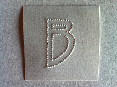


And this is what they looked like lined up together on a piece of blackboard - yum! Back to NY transmissions soon!


I am also feeling good about the alphabet I am doing and have some weird and wonderful ideas in mind for the final piece. So you can tell I am feeling happy and inspired by this little project this year!
As ever, with ALaW, there are two alphabets to complete in the 52 weeks, and one of these has some rule or guides around it. It has to be a polka dot or pixel or dotty alphabet. That leaves things pretty wide open for folk; yet also gives a bit of coherence to the finished pieces if we ever get to display them somewhere.
I went for white on white (one of my all time favourite combinations) and pierced the letters through the paper. I only had the i-Phone over at the shed studio so the colours appear more dove-grey on dove-grey; but the sense of them comes through I think.
Here is where I have gotten to so far A, B, C and D


And this is what they looked like lined up together on a piece of blackboard - yum! Back to NY transmissions soon!

And then just because I am who I am - I took a shot of the multi-pierced piece of mat board I had been using to pierce into - the lovely pattern left was too good to ignore!

Want to close my eyes and feel them.
ReplyDeleteYum indeed! These look great (and the last one!)
ReplyDeleteFiona....love these letter forms...so elegant!! The dot pattern is a favorite of mine and love the texture of them.....and that pattern at the end is also exquisite....what a way to make a drawing without even trying! You'll have a great year in letters, I'm sure!
ReplyDeleteI love white on white too Fiona, and it reminds me of Braille.
ReplyDeletei often love the stitched pattern which forms below my work.
ReplyDeleteI do love dots AND white on white.. so these are wonderful to me.
ReplyDeleteI remember a much earlier post where you were working on braille paper Fiona and texture is so prevalent in your beautiful work. Is this your own typeface design ? It has a lovely elegance to it and as for that last photo.... that's just begging to appear in some other work...
ReplyDeleteAnnie - yes they invite you to read them with your fingers don't they?
ReplyDeleteClaire thank you, the last one appeals doesn't it?
Hi Patti - dots and dashes appeal and I ' m glad you like these ones, I think I shall have a happy letter year.
Thanks Helen I often think White on White is perfection! There is something tactile and Braille-ish about the dots indeed.
Velma - I often love the hieroglyphics that appear underneath as well; they tell another story.
Thanks Donna - almost the perfect combination....
Thank you Lesley... It's not but I wish it was! I love it's leggy elegance and like you am fond of that last one...it has such personality aside from all the formality.
Fiona, these are lovely and sophisticated as always, and I especially like the last shot of your mat board--a beautiful piece in it's own right!
ReplyDeleteThanks Jane - yes the byproducts are often as interesting as the products! I like their elegance too.
ReplyDelete