I did find the time to finish off these fun capitals through the week and I am happy with how they came out. I feel quite scratchy with my calligraphy so its nice to have some time to spend on simple things to remember the how to s.
Once I was happy with the layout and design, I traced the letters.

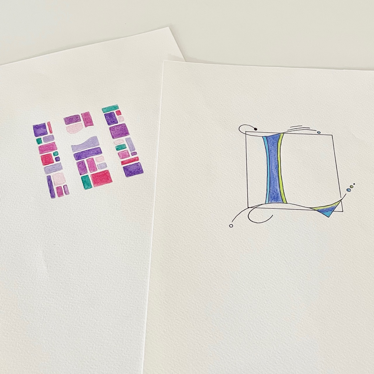
The reveals...


I began colouring in the letters.


And then added water.


And in the case of the L; I let it dry and then drew over it with a black pen, then rubbed out the pencil marks.

And with the H I simply had to let it dry and then rub out the pencil marks. I modified the colour placement in a few of the blocks as per my draft, and think it looks better than before.

And ta da, here they are together, ready to pack and pop in the post!
Truth be told, I had packed them up and sealed the envelope before I remembered that I hadn't actually photographed them finished. Typical. So the caption to this photo should probably read:
And ta da, here they are together, ready to pack again and pop in the post!
can't count how many times I've sealed an envelop only to recall something else needing to be added or photographed ... or both!
ReplyDeletethinking back to your Charles Rennie Mackintosh reference, I couldn't help wondering what it might have been like to ink in the "leading" between the blocks of color and around the initial "H" ... a lot more work for sure ;)
So pleased to know I am not alone in the too-quick-to self stakes! Sooooomany times! Lookign at the CRM letters, i realised I had learnt them this way - they were first taught by a friend Gemma, and they reference Adolf Bernd's painted letters from earlier last century. You made me stop and look at them differently and I think they would look very mosaic or stained glass like if the lines between were darkened. Makes me want to go and try on a spare I might have...
DeleteCongratulations.
ReplyDeleteEs un excelente trabajo de tus libros de artista.