So I had worked out the format and the paper, and the folding and the layout and the writing.
The next phase was to select papers and decide placement of the various elements.
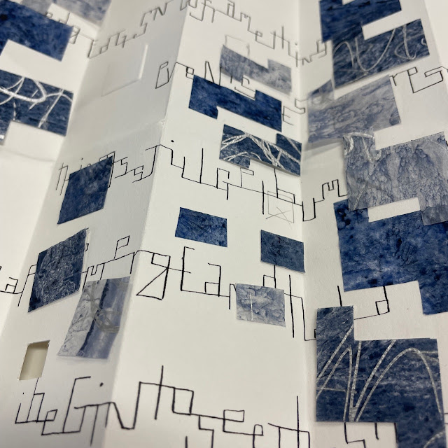
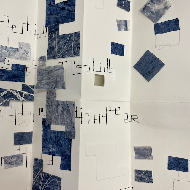
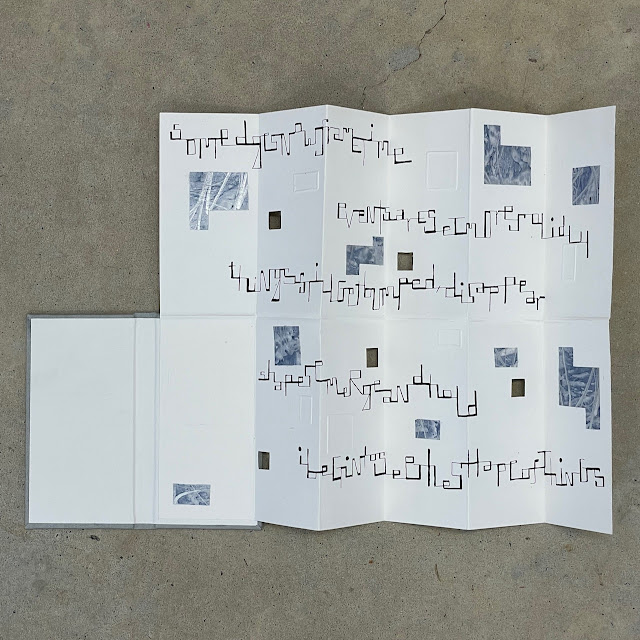
I tend to like odd numbers, and each book ended up with 5 cut outs, 7 embosses and 9 paper chunks.
I have mentioned previously that these collaborative books are for me, siblings. They are not perfect replicable editions of each other, and so I found that my calligraphy was larger in some places on one than the other; it went further across the page on one of them and the like. And yet you just know they are related when you look at them.
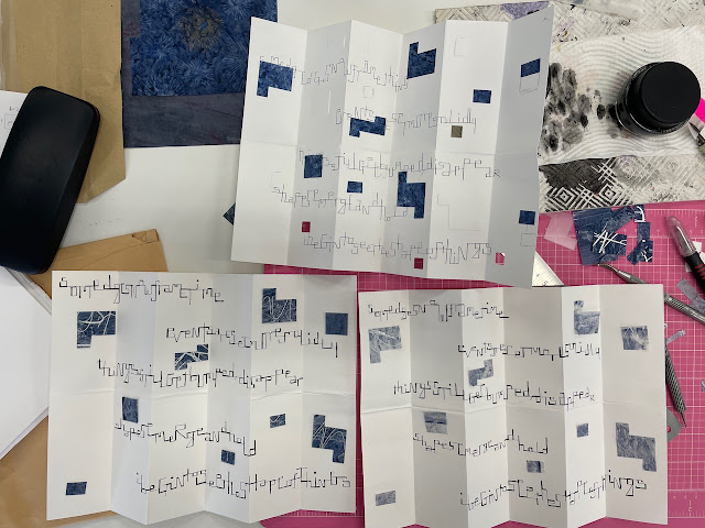
Here I'm checking and comparing that I have the right number and same sizes of paper chunks. I think I was also comparing should one book be dark and one light? And you can see an error I made in the calligraphy underneath, as well as some variations on shapes where I thought something needed to be larger, and changing placement of bits for better balance.
A dark, a light and medium in progress...
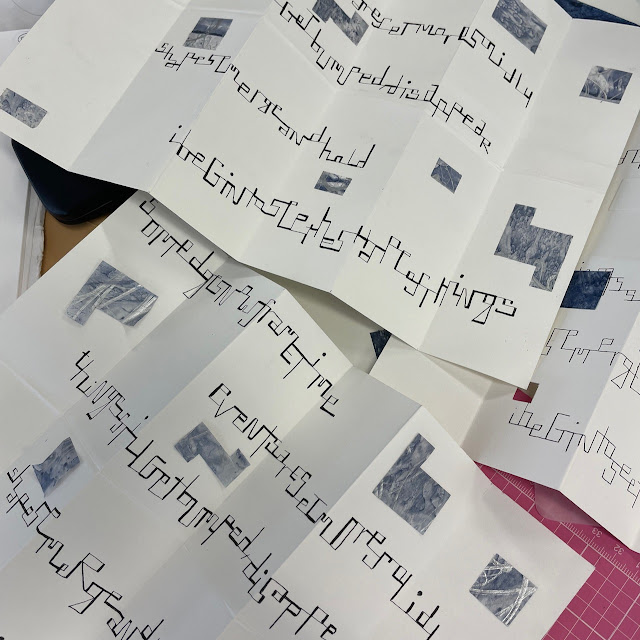
And then converting to two light ones!
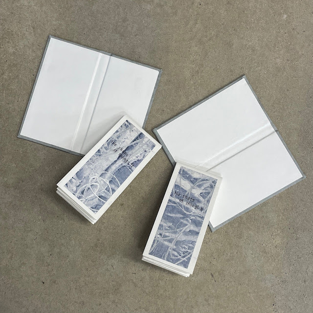
Folded with their title pages, ready to attach to their covers
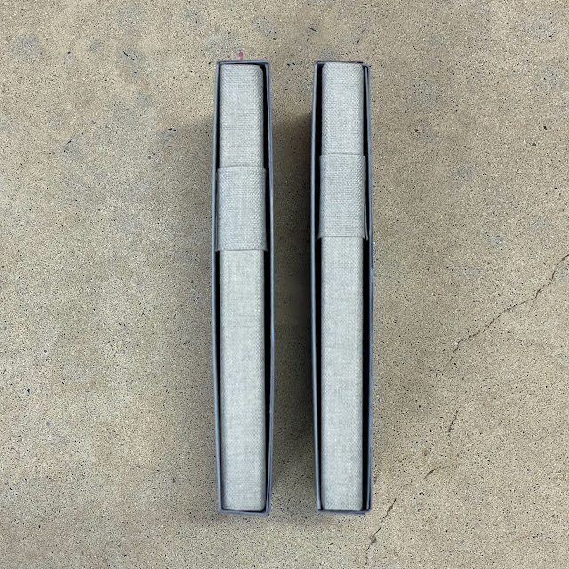
Testing cover book cloth with card to make the slipcase, and thinking that the tonality is working.
.jpeg)
.jpeg)
the shape of things in-deed
ReplyDeleteThe shape emerges…go well
ReplyDelete