As Barry mentioned, we spent a day in the studio together last week beginning a small collaborative project - a rainbow of kindness.
You can guess from this that I got orange!

We have come up with 7 quotes, one for each colour of the rainbow and Barry began with red and I have followed up with orange.
It was fun to sit in the new studio and test out a bunch of things - and I have to say they worked, even the tidying up and putting things back in their place bit!
So I set the type, then proofed it.

Here is proof 1 where I was worried about how tight "FEEL" felt. I am no typographer or designer, but as a calligrapher I knew it needed some space.

By Proof 7, after having played with a multiplicity of spacing options, I felt good to go.

So off I went.
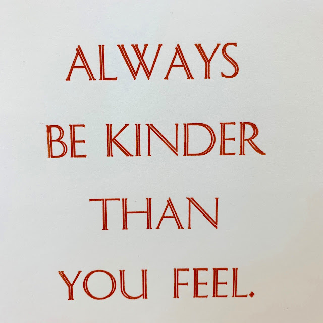

This is a series of mini-posters. They are about 17.5cm (h) x 12.5cm (w).
I really liked these two proofs, where I re-printed after changing the position slightly. As ever, you learn from your mistakes and I realised there could be something great in this idea somewhere down the track!


And here they are at the end of our first ever printing day - next to each other, drying.

what a good thought!
ReplyDeleteA rainbow of kindness...I really like the idea and some of the words are just great. This one feels as if its for me personally! There are times I feel less than kind...so I'd better get with the program. Go well.
Deletelove seeing the proof with its wayward "O" ... and the echoed text ...
ReplyDeleteYep Liz - it is pretty easy to pop an O in upside down! Luckily I noticed it too. I really, really like the shadow effect of the placement changes and can barely wait to go play with the notion! Bu I have a few more colours to set and print before play is permitted, grin.
DeleteI love the double lines of this typeface and sort of enjoy the ghostly quality of the overprints. Good call on "FEEL". I am looking forward to the rest of the kindness rainbow.
ReplyDeleteIt is a very fine typeface isn't it Dana - elegant with the double line and not too fussy or busy with it. The overprinting offers an echo or a repeat in a way - doubling down on the sentiment. Just looking at the original FEEL made me squirm and I knew it needed to be released!! Go well.
Deletenice !
ReplyDeleteThanks Annick -I was quite happy get the orange one and I like the way it all worked out. Go well.
Delete