I am remaining true to my goal of attempting to 'play' with pebbles and stones in as many ways as I can without actually landing on anything decisively. I have painted pebbles with watercolour, and am stitching pebbles onto fabric. I most recently began to play with wrapping cement-cast pebbles; and have started to do some calligraphic renderings as well.
I think I first started wrapping pebbles a decade or so ago... just for fun.
I had these two cement-cast pebbles sitting on my desk which I had wrapped, in my own fashion, with some Habu threads. I had popped outside the studio and found some twigs from the lilly-pillies that grow there and tucked them into the wrap, and I thought to do some more.
I liked the idea of using the cement pebbles that we cast at home; with Habu thread, rather than the more traditional way with actual stones and cane that goes on wet, and shrinks to hold onto the stone as it dries.
So I have done some more. I used brown string, some different Habu thread and a black silk tangle that I managed to get a few lengths out of!
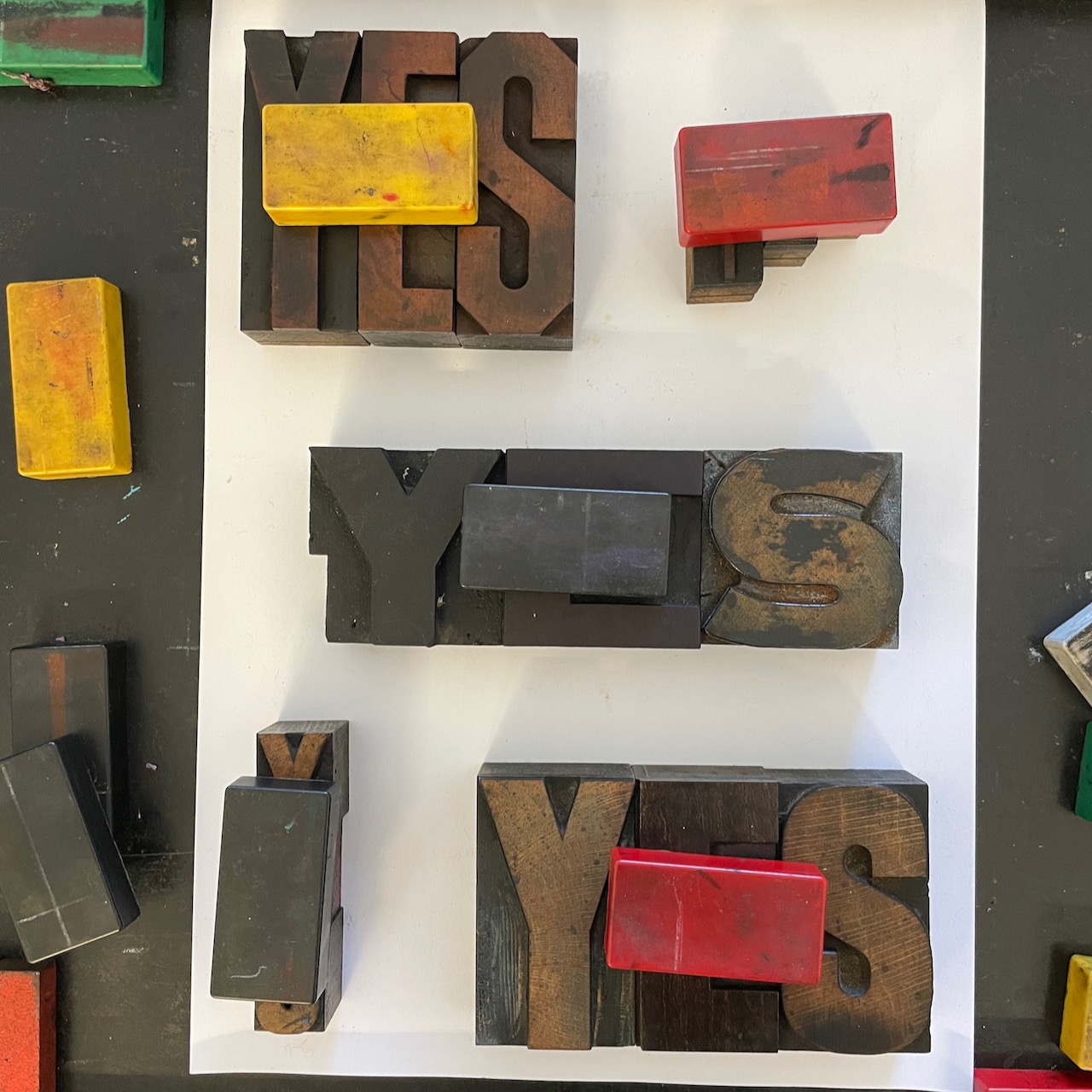
I also used some heavy duty cotton thread that I would normally use for tying blocks of type together.
I love how this one looks...
What to do with them I do not yet know. As per my desire to push further, go sideways, don't simply sit and think I have finished, I am considering how I might be able to use them in a larger piece. It's hard.
And so I turned my mind to words. Last year I wrote the beginnings of a poem titled "Grief is a stone" and soI thought I might play with those words and see what sort of shapes they might make.
My notebook is a place for sketches only - no proper work can be done in there as the paper is pretty ordinary, but I did want to just try a few sketches.
Playing with background colours and shapes.
Here is the before I wet the watercolour pencils - sorry no after shot!
Because I had had done watercolour pebbles in a circle I wondered if the words might look good in a circle - this would really need more work and attention than I gave it here!
I think I could curve the letters more gently - the G and the S both offer a curve and I think I could make the E and the F could also curve. Something to explore
As is so often the case, the more you do, the more you think about what else you could do and I then began to think it might simply look nicer in a straight line.
I repeated the angled G in the first line, but decided I preferred a more upright look for the second, and also a narrow - wide variation. I think this gives me something to take further and refine as well. At the last minute I added in the downward serif on the G and I don't like it.
Again, no idea what I will do with the words, but it gets your brain active in a bunch of different ways and helps you not shut anything down too early...
I like the way I went with a stone shape for the O. It just happened as the pencil went onto the page and I love those moments. In the bottom one I like how the baseline is flat and there is movement in the upper area... we shall see.

.jpeg)
.jpeg)
.jpeg)

.jpeg)


.jpeg)
.jpeg)


.jpeg)


.jpeg)
.jpeg)


.jpeg)


.jpeg)



.jpeg)
.jpeg)


.jpeg)